Global Accessibility Awareness Day at Stanford
2023 GAAD Sessions
May 12 , 2023 11 a.m.
Designing for Accessibility- Webcamp
Gain an understanding of accessibility guidance that is relevant in the design process, before development begins. Some considerations are strictly about the appearance of a design (such as color contrast), while some may require the creation of additional designs, or additions to a design, specifically to meet the functional objective.
May 12, 2023 2 p.m.
Accessible Data Tables
Creating accessible data tables for websites is a common challenge that we see across Stanford's digital footprint. This session focuses on how web developers can structure and build accessible data tables using a variety of techniques.
May 15, 2023 2 p.m.
Storyline Accessibility Workshop
This workshop will cover strategies for designing and creating accessible content in Storyline, such as best practices for designing interactive content and integrating media, and implementing accessibility features in the player.
After this session, attendees:
- Will be able to design accessible Storyline content
- Implement strategies to improve the accessibility of their Storyline content
May 18, 2023 1 p.m.
Rise Accessibility Workshop
This workshop will cover strategies for designing and creating accessible content in Rise, such as best practices for using Rise blocks to structure a Rise page. It will also cover how to choose accessible interactive Rise blocks and add alternative text.
After the session, attendees:
- Will be able to design accessible Rise content
- Use the strategies covered to make their Rise content more accessible
May 23, 2023 1 p.m.
Remediating PDF Documents with Equidox
PDF documents on websites and can pose multiple accessibility barriers. Equidox is a web-based PDF remediation tool available to the Stanford community that simplifies the accessibility remediation process for most PDF documents. Additionally, a brief discussion of other PDF remediation strategies will be shared in this session.
After the session, attendees will know:
- How to upload documents to Equidox
- How to Specify headers and make images accessible
- The steps to verify a document's reading order
- Options for scaling up PDF accessibility efforts
Accessibility in 10 Minutes
Not enough time to sit through an accessibility presentation? Want to learn and explore quick accessibility tips in 10 minutes or less? Read on for our Accessibility-in-10-Minutes activities in recognition of Global Accessibility Awareness Day.
The Accessibility-in-10-Minutes activities focus on a variety of digital accessibility topics, from reading about accessibility issues to viewing YouTube videos on assistive technology tools and hands-on exercises for you to complete. All you need is 10 minutes and a Web browser to participate!
Videos and audios intended for university business purposes need to have accurate captions and transcripts respectively.
What are considered accurate captions?
Your messages need to be communicated accurately to your audience. Only captions transcribed by humans can achieve a high degree of accuracy. Computer-generated (or auto-generated) captions have not reached that level yet. If you see "auto-generated" on YouTube, or if you use Zoom's captions, they are computer-generated captions.
How do I get humans to transcribe my videos?
You may do it yourself using the YouTube subtitles editor (which may be exported out to other video players), or pay for a vendor's service. Stanford has negotiated pricing with several captioning vendors.
For more information on captioning, including what to do about captions for live events, see the SODA page on Captions and Audio Descriptions.
People with certain disabilities, whether temporary or permanent, often navigate files and the web using a keyboard. These may be low-vision users, users with limited motor control, or screen reader users. There are also users who find the keyboard more efficient than a mouse or who have broken equipment. Although most of us will never be able to fully grasp the keyboard-only user experience, an important takeaway from this activity is to increase our capacity for understanding and become more sensitive to the keyboard-only user’s experience.
Activity
Using only your keyboard, navigate your favorite websites, check and reply to an email, watch a video, or shop online for only 10 minutes a day.
Keyboard Instructions Quick Start:
Press Tab to navigate to the next link, button, or edit field.
Press Shift+Tab to navigate back to the previous link, button, or edit field.
Press Enter or spacebar on a link to open it, activate a button, or open a menu.
Use arrow keys to scroll or move up and down through dropdown options.
Press escape to close dialogs or exit out of a dropdown.
During your scheduled activity time, please attempt the following using the keyboard only:
Navigate through menu options to reach a specific location
Compose an email, run spell check and send
Play a video, pause, and adjust the volume
Respond to prompts like "Accept all cookies"
Close an ad
Consider, do I feel lost or am I confident of my location?
Inclusive design benefits us all. Watch a video or read an article to learn more about keyboard users and navigation:
Color is used on the web to engage users, convey information and enhance design. Although color is beneficial to many users, it can create accessibility barriers for others. Colorblind and other visually impaired users may struggle to read and understand your content if foreground and background colors do not meet the minimum contrast ratio of 4.5:1.
Contrast Ratio Explained
Contrast ratio refers to how bright or dark colors appear on the screen or the luminance of the brighter color to the darker color. Ratios range from 1:1 to 21:1 where the first number refers to the lighter color and the second to the dark color.
A minimum contrast ratio of 4.5:1 is required for normal text and images-as-text against the background color unless the text is Large. Large text passes contrast at 3.1:1 if it is at least 18 points or 14 points and bold.
Testing Contrast Ratio
There are many color contrast resources on the web, Stanford's own Interactive Color Chart Tool is a great place to start on your learning journey and will support you in creating content that is contrast error free.
Let’s try it!
This activity uses colors of the same family to illustrate that:
Using lighter or darker shades may resolve contrast errors against certain background colors.
Some shades of color will pass contrast for Large text only.
You have options! Reevaluating your color palette may not be necessary.
Instructions:
Paste the HEX color values listed below into the "Custom Foreground" field in the contrast check form
Leave "Foreground" and "Background Color" options as "Cardinal"
Press "Go"
Test results load in the "Custom Foreground" column in the chart below
HEX color value: #C5EFF7 - light blue
HEX color value: #66D0E5 - medium blue
HEX color value: #2EBFDC - darker blue
Understanding foreground and background color combination test results:
Text strikethrough indicates the color combination fails contrast
"Large Text Only" indicates the color combination passes contrast for Large text only and includes the ratio for reference
"Passes" indicates the color combination passes contrast minimum requirements and includes the ratio for reference
Continue to test the colors above against different foreground and background colors or use Google Color Picker to generate the HEX values for colors of your choice.
There are many additional resources available, we recommend:
According to the NHIS, about 13% of the population are "low-vision" as opposed to no-vision/blindness. One of the most effective and simplest ways for this population to browse the internet is by using browser zoom to make everything larger. The good news is that testing browser zoom is super easy.
- Bring up a web browser and navigate to the page you want to test.
Press hold the Ctrl (windows) or Cmd (mac) key and press "+" until the browser says you have reached 200% view.
- Navigate the site as normal.
What you are looking for
- Do the text and elements resize? The text should increase in size and be easier to read. If it doesn't, then it's a failure.
- Can all features still be used? Do buttons or controls disappear? Or do they change into other buttons (like a hamburger menu for mobile devices is common). Do these new controls work the same as the regular size ones?
- Is any text cut off or difficult to read? A failure would be if the text is sitting on other text, the text doesn't appear on screen anymore, or other failures where not all the content is available to you.
- Does the layout still make sense? The layout should still make sense to a user. While it doesn't need to be exactly the same, it should still offer all the same functionality and information. Note that what you will see will probably be a variation on the mobile design.
Want to see it in action? Here is a video tutorial for changing your browser’s zoom setting.
Want to Know More?
The Office of Digital Accessibility team is available to help test web pages for accessibility and provide guidance for developing accessible websites. Reach out to us via our weekly Accessibility Office Hours or a general request for assistance if you have any questions.
Asking questions about accessibility for individuals with disabilities is a critical, and sometimes overlooked, part of the vendor review and procurement process. Whether it’s a simple website, a web-based application, a mobile app, or some other type of electronic content, a vendor may not have the necessary information to share regarding support for accessibility. So, how will you be able to make a good decision? Here are three steps to help get started.
Obtain Documentation
Start by asking a vendor for any accessibility documentation, such as a Voluntary Product Accessibility Template (aka “VPAT”), accessibility conformance report, or third-party accessibility evaluation. The VPAT tends to be the most common and is created by the vendor to document a product’s level of conformance with current accessibility standards. Products change on a regular basis, so be sure to request accessibility documentation that is less than 12 months old.
Ask Questions
Start with documentation and then ask questions about how the product supports accessibility. For example, has the vendor evaluated if the product works with a screen-reader (e.g., JAWS, NVDA, VoiceOver, etc.) or ever tested with voice recognition software? Is it possible to use the keyboard only to navigate and interact with all the features?
Asking accessibility questions when conducting a Request for Proposals (RFP) or Request for Information (RFI) can assess not only the accessibility of the digital product, but also the accessibility maturity of a potential vendor, developer, or contractor. See the list of Accessibility Questions for RFPs and RFIs for ideas.
Request Demonstrations
Product demonstrations can provide an up-close view of a product’s functionality and accessibility testing can be part of these presentations. Asking a vendor to demonstrate real-world scenarios while using only the keyboard or with specific assistive technology applications (e.g., a screen-reader), can help identify existing accessibility barriers. This can also be an opportunity to learn if there are potential workarounds or other alternative ways to interact with the website or online application.
Want to Know More?
The Office of Digital Accessibility team is available to help you review a vendor’s documentation, responses to questions, and understand a product’s level of conformance with established accessibility standards. Reach out to us via our weekly Accessibility Office Hours or general request for assistance if you have any questions.
In November 2009, Google combined their automatic speech recognition (ASR) functionality with YouTube’s captioning support. The intent was to use machine learning and speech recognition algorithms to simplify the creation of captioned videos and provide a scalable solution to making the hundreds of hours of video uploaded to YouTube every minute more accessible. And while early versions of Google’s ASR led to rather spectacular caption failures (the Jamaican Vacation Hoax is still my favorite!), the speech recognition and timing is now far more accurate than ever before.
However, it is still important to verify if the on-screen text is indeed accurate. Captions provide the text equivalent of any spoken dialogue and include other audio information, such as who is speaking and the presence of any meaningful sound effects. And while captions can support access for people who are deaf or hard of hearing, a 2016 Oregon State study found captions can positively impact all students in the classroom environment.
Quick Check for Captioning
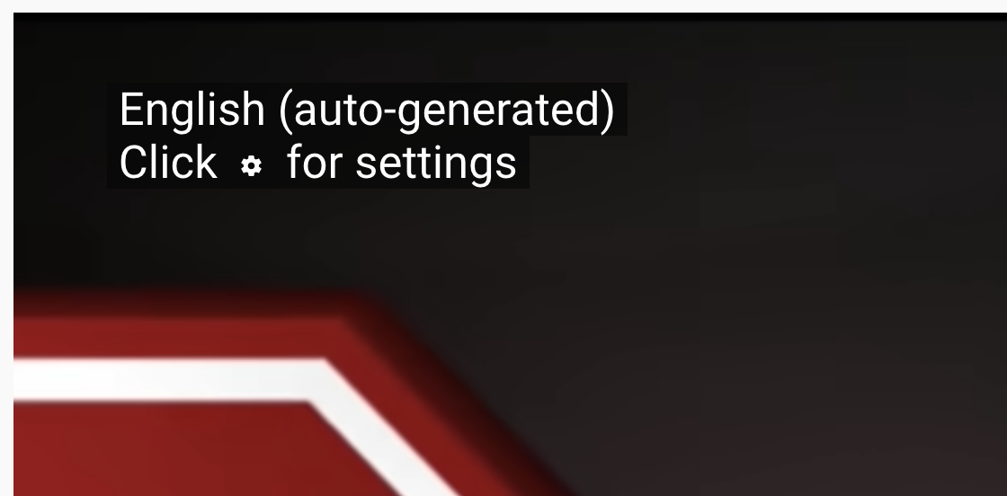
If using the YouTube platform, you can quickly check to see if your video has captions by clicking on the CC button and then looking to see what appears in the upper left corner of the video. If the upper left corner shows the text “English (auto-generated)” as in the example below, then these are captions that were automatically created by YouTube.
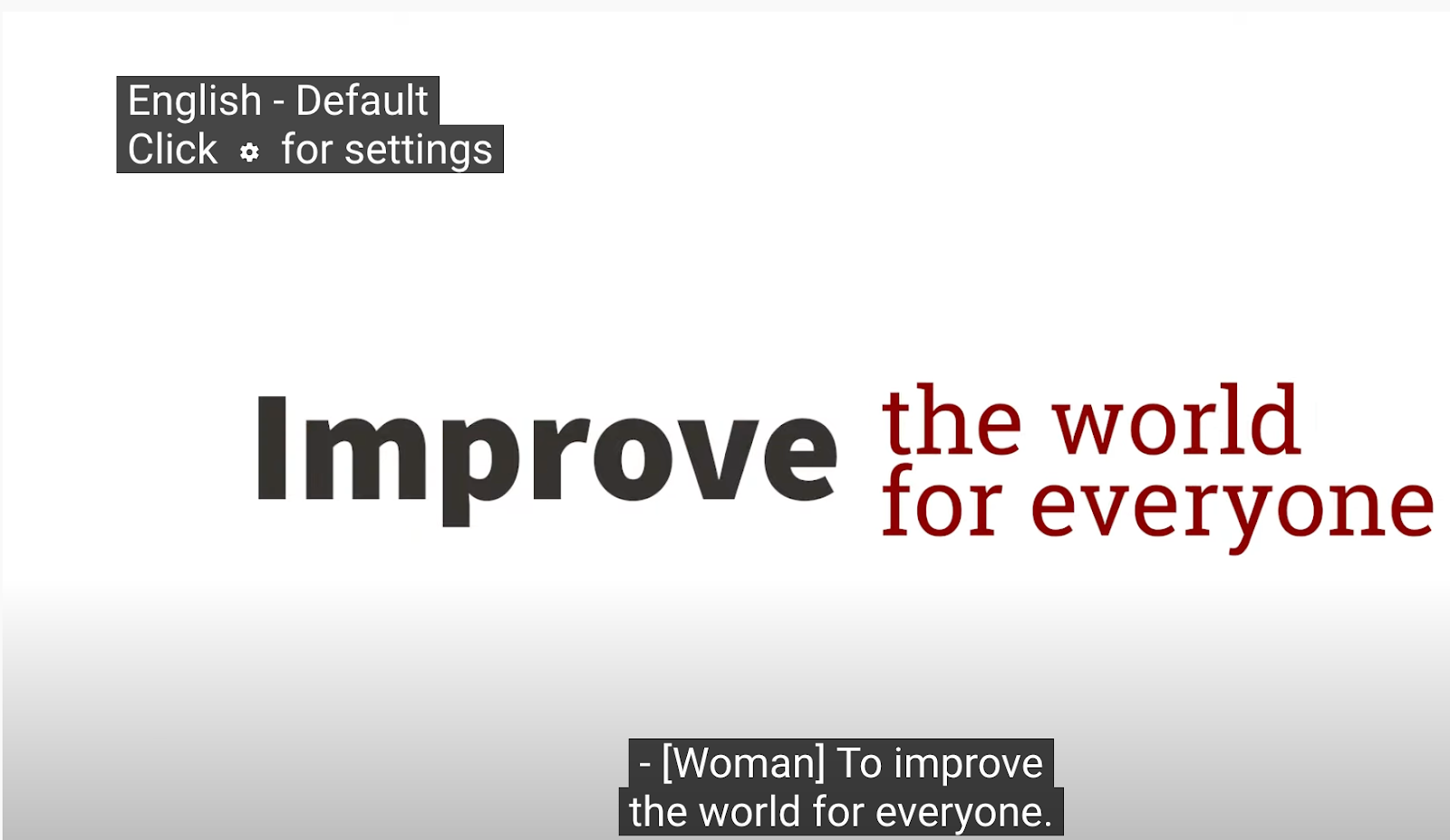
But if the text in the upper left corner shows the text “English - Default” as in the next example, then these are captions that have been modified or reviewed and should be accurate.
If you see the “English (auto-generated)” text in the upper left corner of your YouTube video, then you will need to take steps to ensure the captions are accurate.
Want to Know More?
Captions are more than whether or not there is text on the screen and reviewing whether or not your video has accurate captions is an important step. It is also important to note that even though a video has auto-generated captions, you can still use those auto-generated captions to create an accurate caption file. YouTube has two easy resources to help you with those steps:
The Office of Digital Accessibility website provides additional information on captioning and audio descriptions, including negotiated rates for captioning providers when you want to just outsource that work. Reach out to us via our weekly Accessibility Office Hours or general request for assistance if you have any questions.
A survey of screen reader users conducted by WebAIM found that over 75% felt PDFs are likely or somewhat likely to pose significant accessibility barriers. Creating PDF documents from Microsoft Word that are more accessible starts early in the document authoring process. Two quick steps can include adding headings to provide navigation landmarks for screen reader users and using Microsoft Word’s Accessibility Checker. The Accessibility Checker will scan your document for common accessibility errors and prompt you for the necessary corrections. Once all the accessibility issues have been corrected, you can export a Microsoft Word document as a more accessible PDF version.
Try these accessibility strategies by opening a Microsoft Word document and following the steps listed below. You can also watch this short tutorial video or review this Microsoft Word Accessibility Guide handout.
Headings
- Open A Microsoft Word Document and select the Styles Pane
- Select all styles
- Highlight the title of the document and control-click (Mac) or right-click (Windows) to select “Heading 1.”
- Additional headings in the document should be tagged. When a heading is updated the style choices like color, bolding, italics, or underlining can easily be transferred to the next heading.
- Verify that the heading follows a logical sequence.
Microsoft Accessibility Checker
- Go to Tools and select Check Accessibility to open the checker
- The Accessibility checker shows any errors or potential accessibility barriers and provides steps on how to fix them.
- As they are remediated the errors disappear.
- Alt text can be added to images by right-clicking (Windows) or control-click (Mac).
- Don’t use words like image in the description because the screen reader will announce that it is an image.
- Describe the picture succinctly and limit the description to 125 characters max.
Exporting A PDF
- When all the accessibility errors have been corrected it is time to export the document as a PDF.
- Select Save As and choose the PDF option
- Make sure to choose best for electronic distribution and accessibility.
Reviewing the presence, order, and nesting of headings on your website is an essential step in making it accessible. Most people browse a site by visiting a page, and scrolling/scanning through it, allowing them to quickly get a sense of the content and what sections they may be interested in. This scanning includes noticing headings, which stand out due to their appearance of being larger, bold, or otherwise visually distinct. Headings help to organize content and make it quick and easy to focus on the parts you are most interested in.
If the headings on your site are properly marked up using heading elements (h1-h6) and properly ordered, this makes it easier for users with disabilities to interact with the site. Correct use of headings will enable screen-reading technology to communicate the heading levels to non-visual users and will allow the headings to still be perceivable if someone uses a custom stylesheet to override yours to better suit their needs.
To check the heading structure on your site you can use several tools, including the Web Developer Toolbar and ANDI.
Using the Web Developer Toolbar
Visit the Web Developer toolbar page and install the plugin for your preferred browser (supported on Chrome, Firefox, and Opera).
Open the page you want to test in the browser
Activate the Web Developer extension. Go to the Information tab and then choose the “View Document Outline” link.
The outline opens in a new tab. Review the outline and make updates to your content/structure as needed.
Using ANDI
Visit the ANDI page and install the bookmark to an easily accessed location, such as the bookmarks toolbar.
Open the page you want to test in the browser.
Activate the bookmark.
Within the tool frame, change the dropdown from “focusable elements” to “structures”.
Expand the “view headings list” to view the outline of headings.
Review the outline and make updates to your content/structure as needed.
Good heading structure
Your heading structure is good if:
All headings on your page appear in the outline. If the text was only styled to make it look like a heading, but not coded with a heading element then it will be missing here.
Heading levels are not skipped. The outline view in the Web Developer toolbar will flag missing levels.
The nesting of heading levels makes logical sense. For example, do the headings nested under another one logically serve as subheadings to that parent heading?
When we talk about making a digital property, such as a website or mobile app, accessible, we often talk about it in the context of how well it works with assistive technology. But there is a wide range of assistive technologies that people with disabilities may use, and you may not be familiar with how they actually work. Watch one or more of the following videos to get a better sense of the kinds of technologies that are available, and how they function when being put to use.
May 12, 2022, 12:00 p.m.
Introducing the WCAG 2.1 and 2.2 Accessibility Standards
- What was added in WCAG 2.1 and 2.2
- Strategies to build websites that also conform with these standards
- What Siteimprove will currently test and identify
May 19, 2022, 10:00 a.m.
Purchasing Accessible Technology: Using and Understanding the VPAT
- Know what a VPAT is and its relevance when procuring accessible digital products
- Understand how one is written and the effort that goes into creating one
- Understand how to spot a poorly written VPAT and how this may impact your follow-up and decision-making process
- Understand how to read and use a well-written VPAT
May 26, 2022, 12:00 p.m.
Instructional Accessibility Principles
- Develop learning objectives that are outcome-oriented
- Know how to use various accessibility best practices, such as heading levels, alternate text, and appropriate color choices to create an accessible syllabus
- Integrate universal design strategies into an instructional environment