Images
Images on web pages provide not only visual appeal, but many times also convey important information. Alternative text, called alt text for short, improves accessibility by providing a text equivalent of the information presented visually. Including alt text with your images ensures all individuals, regardless of visual ability, can engage with your content.
Alt text should be:
- Accurate: including spelling, grammar, and proper punctuation.
- Concise: using the fewest words possible while providing a meaningful description for the image.
- Equivalent: presenting the same content and/or function of the image.
Assistive technologies will announce when an object is an image, so including this information is redundant and not necessary.
Tips for writing effective alt text
- Describe the image as specifically as possible.
- Keep it short (around 125 characters or less).
- Don't include "image of," "picture of," "graphic of" etc.
- Don't include the file extension, .jpg or .png, .gif, etc.
- If the image medium is important (such as a photograph or oil painting), then include the medium in your alt text.
- Image buttons should have an alt attribute that describes the function of the button like, "search," "donate," “sign up,” etc.
Photos
The alt text will depend on the context and intention of the image. For the image below, the alt text could be "XPP Instrument Area Manager Daniel Stefanescu prepares LCLS instruments for beam and experiments in the Chemistry Lab on the historic Stanford University campus. "

Buttons
There are times when images also serve a function, like a button for example. In these cases, the alt text should communicate the function and include the appropriate text from the image. For the button below, the alt text could be "Learn more about our research."

Illustrations, graphs, and charts
Illustrations, graphs, and charts should include alt text that describes the important, relevant information. Instead of repeating every single data point in a chart or graph, it may be more effective to summarize the overall meaning or intent of the graphic representation. Following the image, the key elements may be presented as text on the page for an individual to read and review.
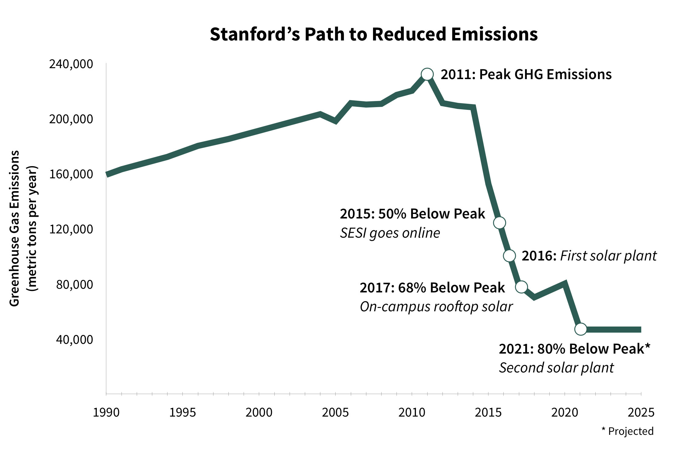
For the graph below, the alt text could be "Graph depicting Stanford's path to reduced emissions from 2011 to 2021"
The text on the page could then identify the key elements as presented in the image, such as:
"Stanford's path to reduced emissions is demonstrated by the peak GHG emissions in 2011, to 2015 at 50% below peak with SESI going online, followed by 2016 and the first solar plant become available. In 2017 emissions were 68% below peak and attributed to on-campus rooftop solar. Projections indicate 2021 to be 80% below peak with a second solar plant becoming available."
Punctuation
When considering punctuation for your image ALT text, the question comes up if you should end the alt text in a period, so that screen reader users know the description is finished as indicated by the pause added by the screen reader. The answer to that question is it depends.
When considering ALT text, adding punctuation depends on the context of the image and how it is used on the page, in addition to normal factors such as what the image looks like. While there are no hard and fast rules one way or the other, the following cases might give you some insight as to what you should do with ALT text punctuation. Also, consider that when a screen reader reads the content of an image, it will read the ALT text first, and then follow that with the word “image”. So, it is not important to add punctuation just for the sake of making the screen reader pause as the screen reader will already do that as part of the process of identifying the type of element it just read.
In the case however where the punctuation would be something other than a period, such as a question mark or exclamation mark, then that element should always be included.
Case 1: Image links
When an image is being used as a link, then the alt text should function as the text for the link. In this case, it will be rare that adding punctuation to the end of the ALT text makes sense.
<a href="#">
   <img src="image.png" alt="Add to Cart">
</a>
Case 2: Short ALT text
When writing ALT text, one of the key principles is to write the text that is as concise as possible. When an ALT text is very short, such as when the ALT is just a few words, then adding punctuation does not make sense. For example, when including a headshot of a person, often the ALT text will just be the person's name, and adding punctuation at the end of this text isn't appropriate.
<img src="image.png" alt="Leland Stanford">
Case 3: 'Regular' ALT text
In this case, we are assuming that the ALT is approximately one sentence in length. This is the most ambiguous of the different cases in that it is entirely appropriate for the period to be present or not. Both of the following examples would be considered appropriate punctuation.
<img src="image.png" alt="The Golden Gate Bridge at sunset with a large container ship traveling underneath">
<img src="image.png" alt="The Golden Gate Bridge at sunset with a large container ship traveling underneath.">
Case 4: Multiple sentences
The final case is when we have an ALT text that has multiple sentences in it. In this case, since there is already a period in the ALT text for one sentence, there should be the same for the second.
<img src="image.png" alt="The Golden Gate Bridge at sunset. Photo courtesy John Smith, AP News.">
Decorative Images
Images that do not convey any meaning or are redundant to other information on the page should be considered decorative images and be given null ALT text of alt=””. It is important to remember that you must include this NULL alt text because without this empty alt attribute, screen reading programs will attempt to ‘guess’ as to what the information is by reading other elements, such as the file name of the image.
While there are no definitive standards that cover every possible scenario of what constitutes a decorative image, consider the following when making a decision:
Design elements
Elements such as borders and lines or other imagery that is exclusively for the design of the page are the most obvious elements that should be considered decorative. This includes any non-meaningful borders, lines, corners, shadows, or spacer images.
‘Stock’ Photos
Images may be included on web pages to convey a feeling about the page or provide some other visual interest, but do not provide any actual detail. Such images may come from a stock photo service or from other sources (it doesn't have to be from a stock service to be considered a stock photo). Per guidance from the W3C Web Accessibility Initiative, a stock photo or image used for ambiance (“eye-candy”) that is used only to add visual interest to the page can be marked as a decorative image.
For example, if you could swap out a photo with another image that completely replaces the people and places within it, but the ALT text wouldn’t change, then it’s probably a non-meaningful photo. When we look at the following image, the photo that accompanies these links to research areas could be any student in any lab on any campus and the alt text would be very similar if not the same.

An image showing a student in a lab on the Stanford Research page. While it could be argued that this is a meaningful image in some way, more than likely this should be considered a decorative "stock" photo as it only provides ‘eye candy’ to the more meaningful links and headings that accompany the image on the right.
Redundant Images
Images may also be used in conjunction with other text on the page without providing any additional content or information. For example, when looking at a list of events from the Stanford Events calendar (below), there is both the title of the story and the picture from the story. In this context, the image doesn’t provide any additional relevant information to a user that is trying to decide if they want to read additional details about the event or not. The events calendar is correctly done therefore by having a NULL alt text for each image.
These events all have a thumbnail picture that accompanies the image title and details. While some of these images will be informative on the details page, in this context they should all be considered decorative and NULL alt text used. Note, if these images are also links, then other techniques need to be used to remove the image entirely from screen reader and keyboard-only users.