 University IT
Keyboard Navigation and Focus Management
Keyboard operability is a foundational principle of web accessibility. All interactive functionality must be fully operable using only a keyboard, without requiring a mouse. This includes, but is not limited to:
- Links and buttons
- Form controls
- Navigation menus
- Modals/dialog windows
- Tab panels and accordions
- Carousels and slideshows
On the web, both the visual focus indicator and the focus order can be programmatically managed. This flexibility is powerful, but requires careful implementation. Proper focus management ensures a logical and intuitive user experience; improper management can create significant accessibility barriers by trapping users or obscuring their location on the page.
Keyboard Navigation
A website is not fully accessible unless it can be operated entirely with a keyboard, as many users cannot use a mouse. While complex components may have specific keyboard patterns, a universal set of commands forms the basis for all keyboard interaction.
Primary Keyboard Commands:
Tab: Moves focus to the next interactive element (e.g., link, button, form field).Shift + Tab: Moves focus to the previous interactive element.Enter: Activates the focused element, such as a link or button.Spacebar: Activates buttons and toggles the state of elements like checkboxes.Arrow Keys: Typically used to navigate within a component (e.g., selecting from a list, moving between radio buttons) or to scroll the page.Escape(Esc): Closes a dialog, modal window, or menu; cancels an in-progress action.
Of these, the Tab and Enter keys are the most important. You should be able to navigate and activate almost everything with just these two keys. Custom keyboard commands are also possible, but they must be documented somewhere that is easily accessible.
Proper use of the tabindex Attribute
The tabindex attribute modifies the keyboard focus order of HTML elements. While it can be a useful tool, its improper use often creates a confusing and inaccessible user experience. Follow these guidelines for correct implementation:
- AVOID:
tabindexwith a positive value (tabindex="1",tabindex="2", etc.) This practice is strongly discouraged. It forces a specific navigation order that overrides the natural, visual flow of the document, which almost always results in a disorienting experience for keyboard users. The focus order should follow the DOM order. - USE:
tabindex="0"This value allows an element that is not normally focusable (such as a<div>or<span>) to be included in the natural keyboard navigation sequence. It is essential for making custom-built interactive controls and widgets accessible. - USE:
tabindex="-1"This value makes an element focusable via scripting (e.g., with JavaScript'selement.focus()method) but removes it from the default keyboard tab order. A user cannotTabto it. This is useful for managing focus programmatically, such as shifting focus to a modal dialog when it opens, or to the target of a "skip to main content" link.
Visual Focus
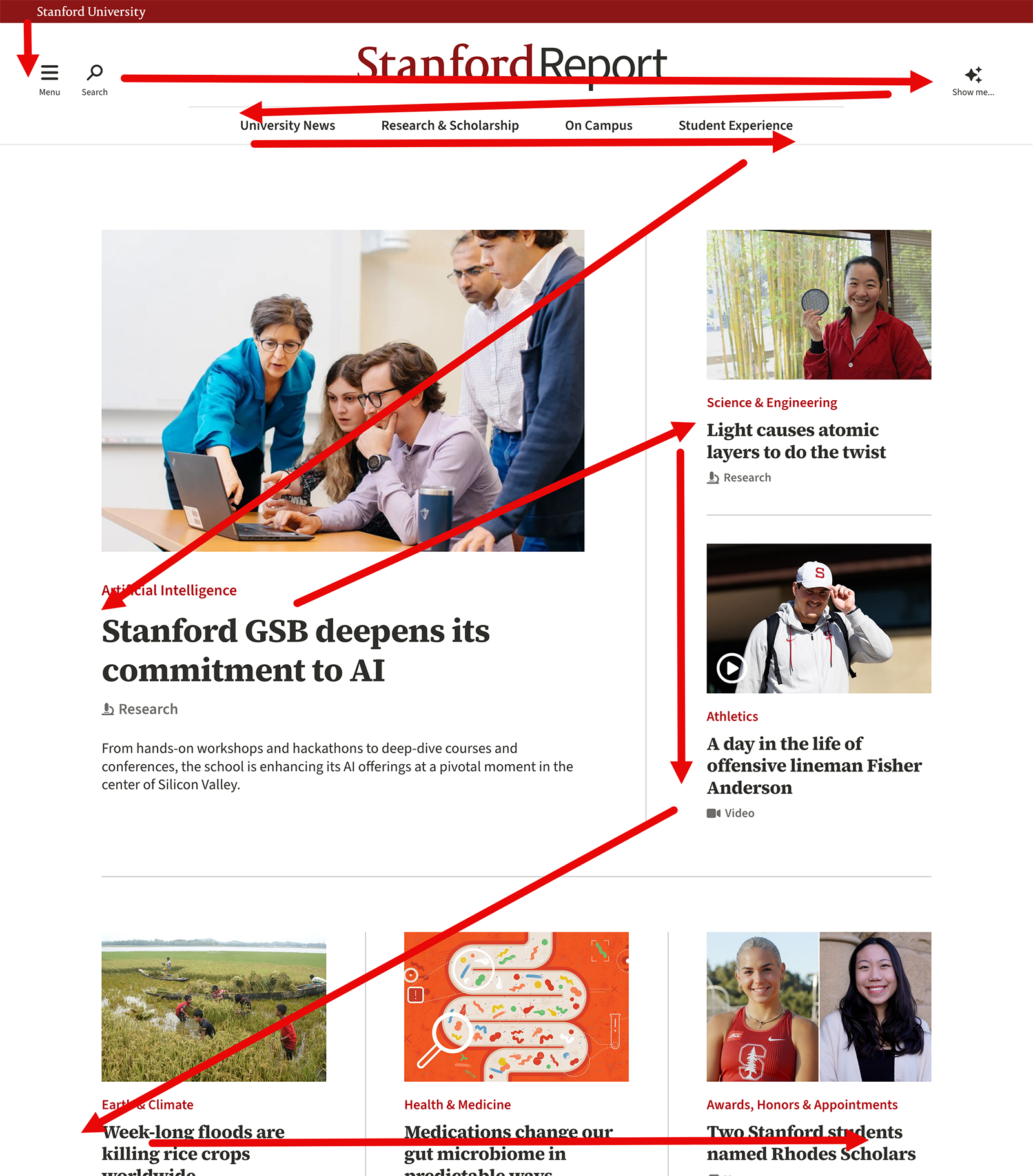
A clear and persistent visual indicator must highlight the element that currently has keyboard focus. For example, the "Campus Life" link on the Stanford home page is currently in focus:

While designers have flexibility in styling the focus state, it must meet two critical accessibility requirements:
- Sufficient Contrast: The focus indicator itself (e.g., the outline) must have a contrast ratio of at least 3:1 against the adjacent background.
- Robustness: The indicator must not rely on color alone. To be effective for all users, the style change should be multi-faceted. Best practice is to combine cues, such as changing the background color and adding a distinct outline or underline.
Focus Order
The keyboard focus order must be logical, typically following the visual flow of the page (top to bottom, left to right). A predictable path is essential for users to understand the page layout and navigate efficiently.