 University IT
Absolute vs. Relative Sizes
Absolute vs. Relative Sizes
When developing for the web, distinguish between absolute (fixed) and relative (flexible) sizing. This is especially important for typography—use relative units for font sizes to better support zoom and user settings.
<style>
   .absolute { font-size: 12px; }
   .relative { font-size: 1em; }
</style>

<p class="absolute">This is an absolute size font.</p>
<p class="relative">This is an relative size font.</p>
Sizing units
Web developers can choose from many units. px is the most common absolute unit; em, rem, and % are the most common relative units.
Absolute Units
- px*: pixels (1px = 1/96 in)
- cm: centimeters
- mm: millimeters
- in: inches (1 in = 96px = 2.54cm)
- pt: points (1pt = 1/72 in)
- pc: picas (1pc = 12pt)
Relative Units
- em*: relative to the element’s font-size (e.g., 2em = 2×)
- rem*: relative to the root font-size
- %*: relative to the parent element
- ex: relative to the font’s x-height
- ch: relative to the width of “0”
- vw: 1% of viewport width
- vh: 1% of viewport height
- vmin: 1% of the smaller viewport dimension
- vmax: 1% of the larger viewport dimension
* = Most commonly used for web typography.
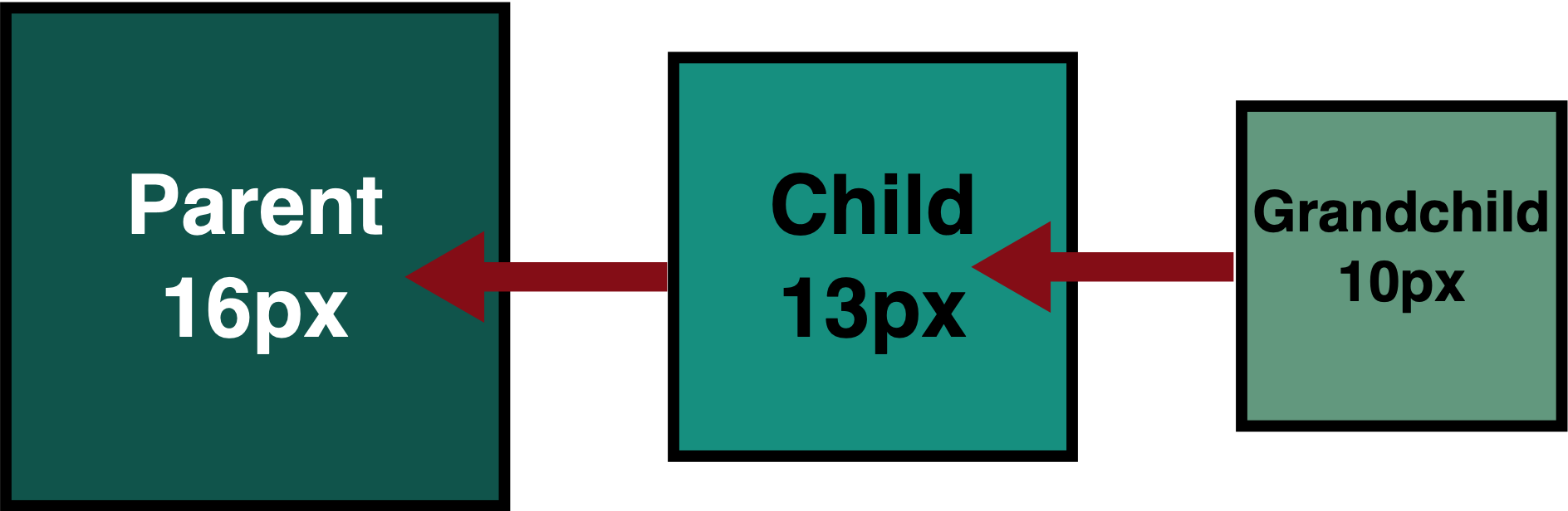
EM vs. REM
The rem units are relative to the root (html) font size, while em units are relative to the computed size of an element’s parent. As a result, em values compound with nesting; rem values remain consistent.
CSS classes
.EM {height: 0.8em; width: 0.8em;}
.REM {height: 0.8rem; width: 0.8rem;}
Using em (compounds):
<div>Parent (Root)
  <div class="EM">Child
    <div class="EM">Grandchild</div>
  </div>
</div>
This will produce 3 DIVs embedded inside each other which will look like this:
Using rem (does not compound):
<div>Parent (Root)
  <div class="REM">Child
    <div class="REM">Grandchild</div>
  </div>
</div>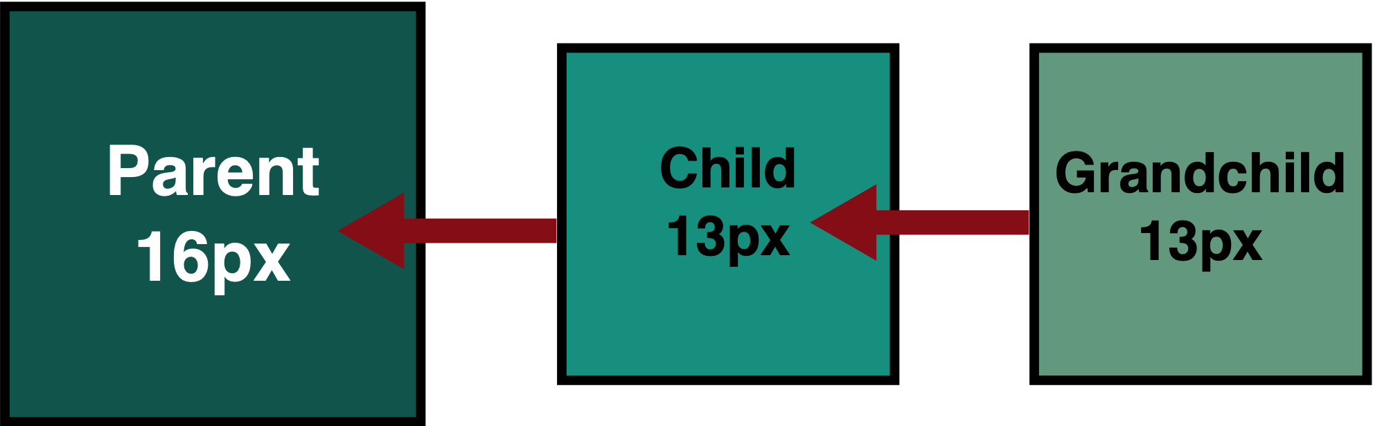
Because the REM is in reference to root, it doesn't matter what the container element is set to, it will always be the same size as it relates to the root size.