Illustrations, graphs, and charts
When images are complex—such as charts and graphs—conveying the same information in brief ALT text can be difficult. Excessively long ALT text is problematic for screen reader users, who cannot navigate it freely like other text blocks. Several strategies can adequately convey complex information to non-visual users.
Note that all these example images must include some ALT text, even when using additional techniques. This ensures non-visual users are aware of the image's presence and location when referenced in text or conversation. Other valid techniques beyond those presented here may exist. The key goal is ensuring the chart's information and purpose are available to users who cannot access it visually.
Alt Text
Simple charts and graphs can often be described using ALT text alone. The following pie chart is simple enough to fully express the details within the image's ALT text.
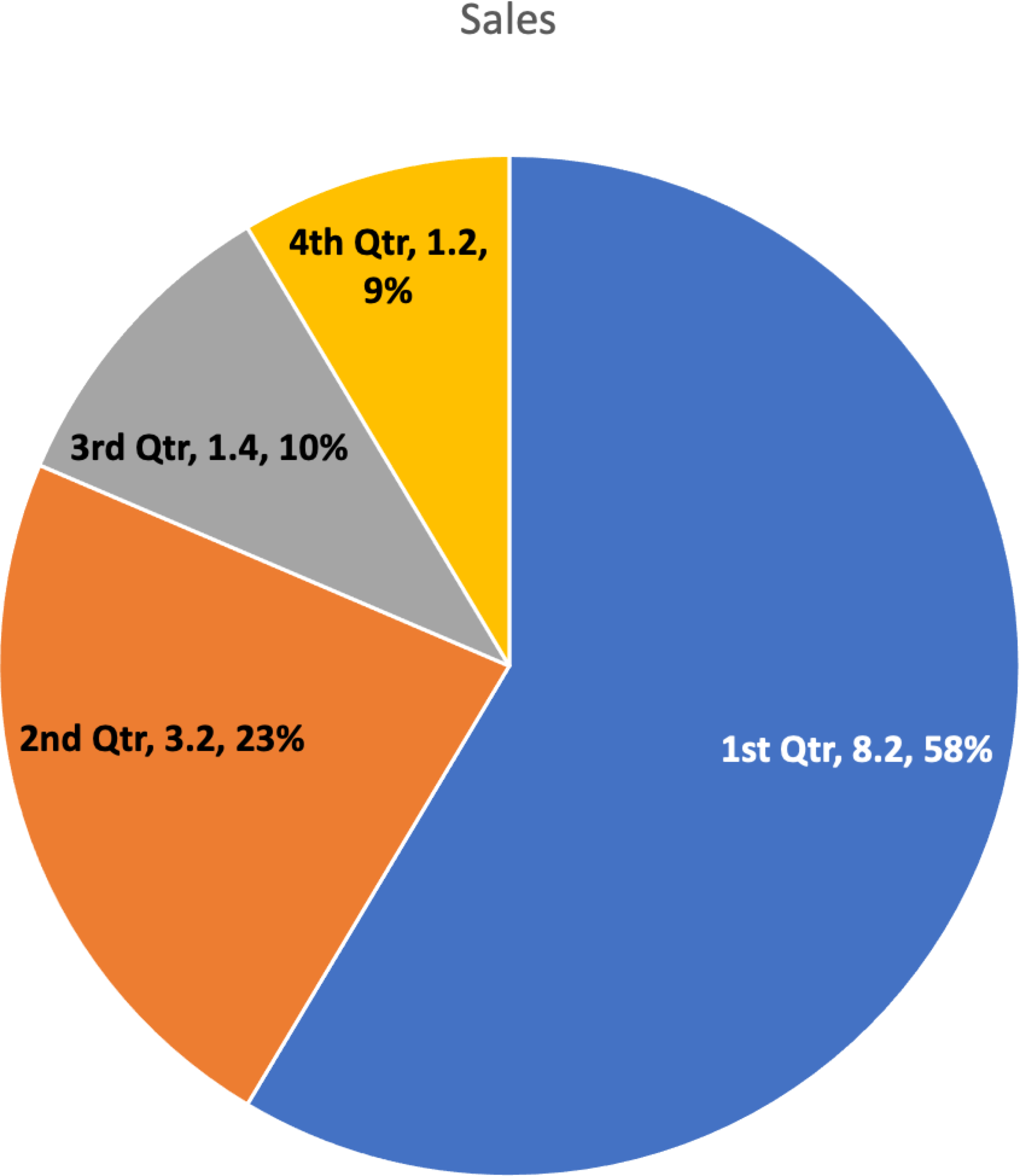
<img src="piechart.png" alt="Pie chart showing sales: 1st Quarter, 8.2, 58%, 2nd quarter, 3.2, 23%, 3rd Quarter, 1.4, 10%, 4th, 1.2, 9%">Note that while the ALT text explains the chart type (pie chart), it does not describe visual details like slice colors. This information is unimportant for non-visual understanding.
Caption
If the description is too long for ALT text, a figcaption (also called a cutline or caption) may be the most appropriate solution. This has the advantage of being readable by all users, not just those using screen readers or other assistive technology.
<figure>
   <img alt="Sales pie chart" src="images/pie-chart-2.png">
   <figcaption>1st Quarter, 8.2, 58%, 2nd quarter, 3.2, 23%, 3rd Quarter, 1.4, 10%, 4th, 1.2, 9%</figcaption>
</figure>
Provide the Raw Data
Another solution is to provide the raw data the graph represents, usually in a table. In the example below, the tabular data is hidden until requested, but it could also be provided through a link to another page, within a modal dialog, or through other techniques.
Body Copy
For some charts and graphs, the information is already explained in the surrounding page text, and the chart is simply a visual representation of that information.
<img alt="Sales chart as described in the text" src="images/pie-chart-2.png">
<p>In the first quarter, we had 8.2 million in sales which represented 58% of all sales for the year. Congratulations sales team! Sales fell off for the rest of the year with only 3.2 million in the second quarter (23%), 1.4 million in the third quarter (10%) and a dismal fourth quarter with only 1.2 million in sales (9%).</p>
Summarize
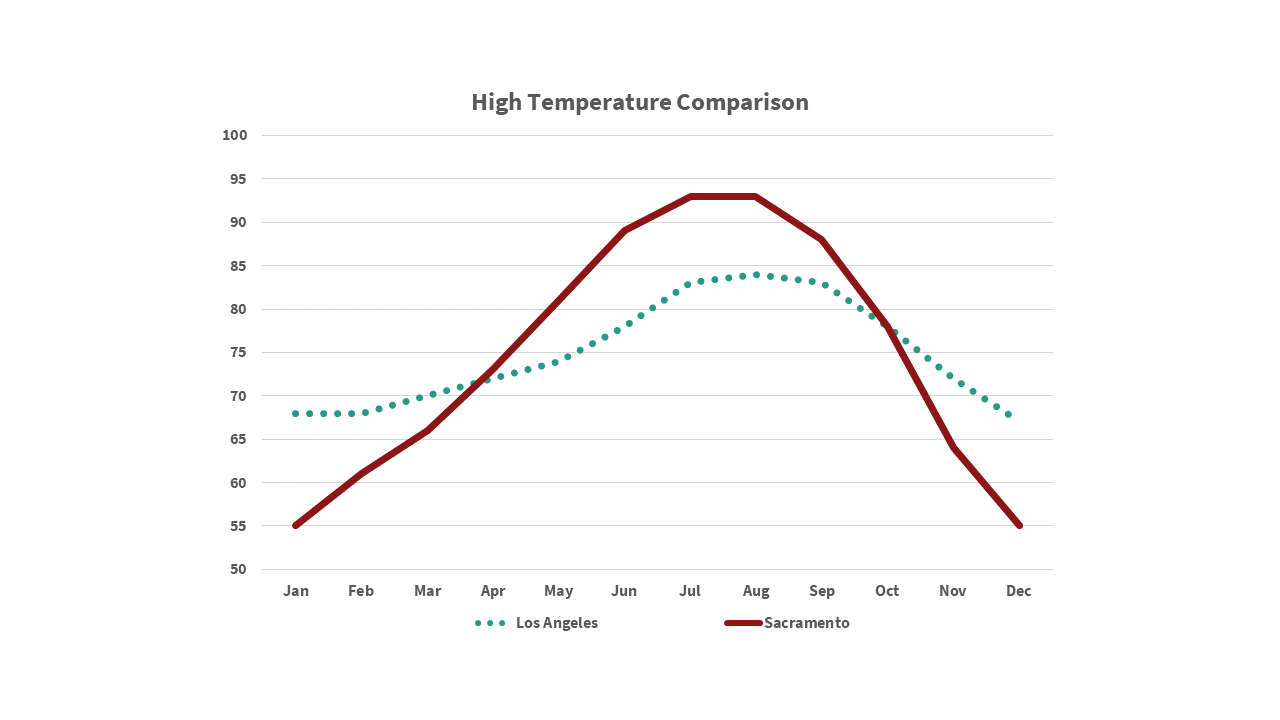
In some cases, summarizing the chart or graph in ALT text is appropriate. This is suitable when identifying every data point is unnecessary. For example, if a graph in an article only compares high temperatures between Sacramento and Los Angeles, the following might be appropriate:
<img alt="Weather chart comparing Sacramento and Los Angeles showing it is hotter in Sacramento during the summer, peaking around July, but warmer in Los Angeles during the winter." src="images/line-chart2.png">