Using Color for Meaning
Color should not be the sole method of providing information. Individuals who are blind, visually impaired, or who have color-blindness may not discern information communicated by color alone.
For example, consider a password form with specific requirements. The first option uses only color to indicate pass/fail status - this is inaccessible. The second option includes checkmarks or x-marks alongside color, making it accessible. Color enhances the design but doesn't carry the information alone.
Color Alone
- Password must be 10 characters long
- Password must contain a number
- Password must contain an uppercase letter
- Password must contain a special character (i.e. &*@%)
Secondary Indicator
- Password must be 10 characters long
- Password must contain a number
- Password must contain an uppercase letter
- Password must contain a special character (i.e. &*@%)
Charts and Graphs
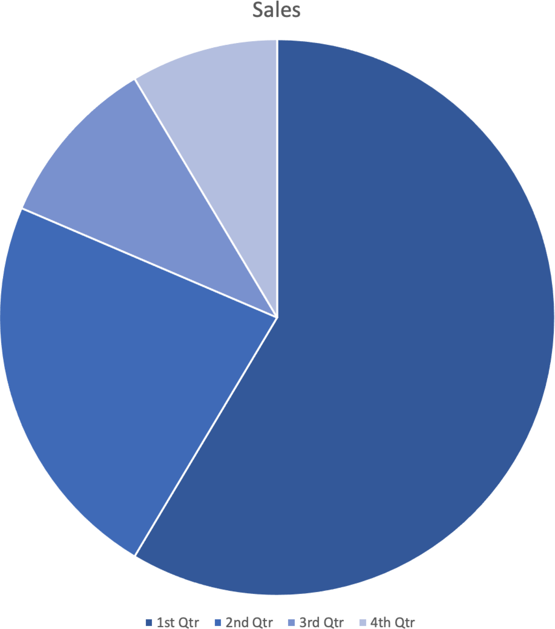
Another consideration is color use in charts and graphs. For example, the following pie chart uses only color to identify and associate each slice with the legend.
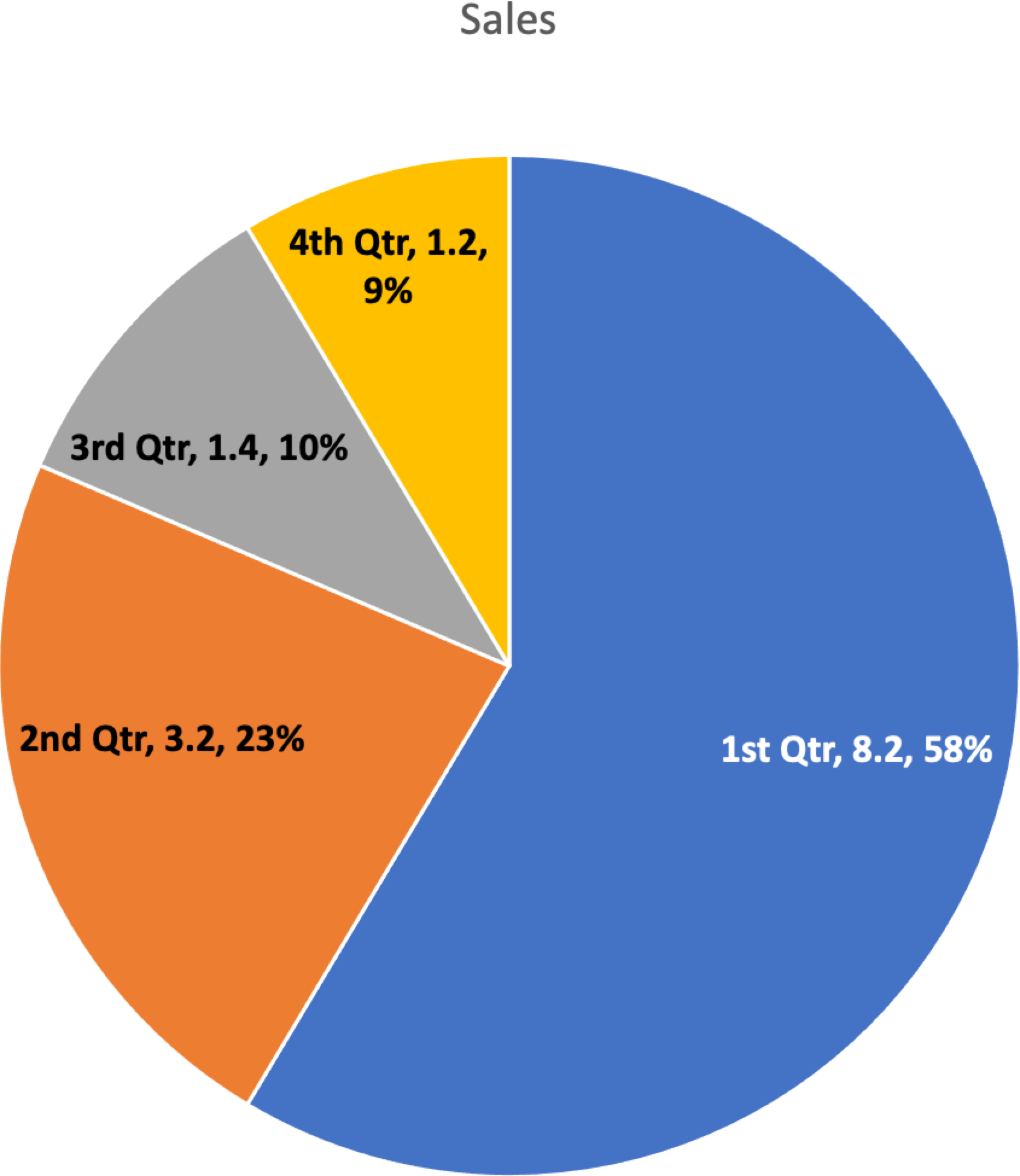
Compare that with the following pie chart showing identical data, where each slice is clearly labeled and there is higher contrast between slices. These secondary indicators make the chart readable for all users.
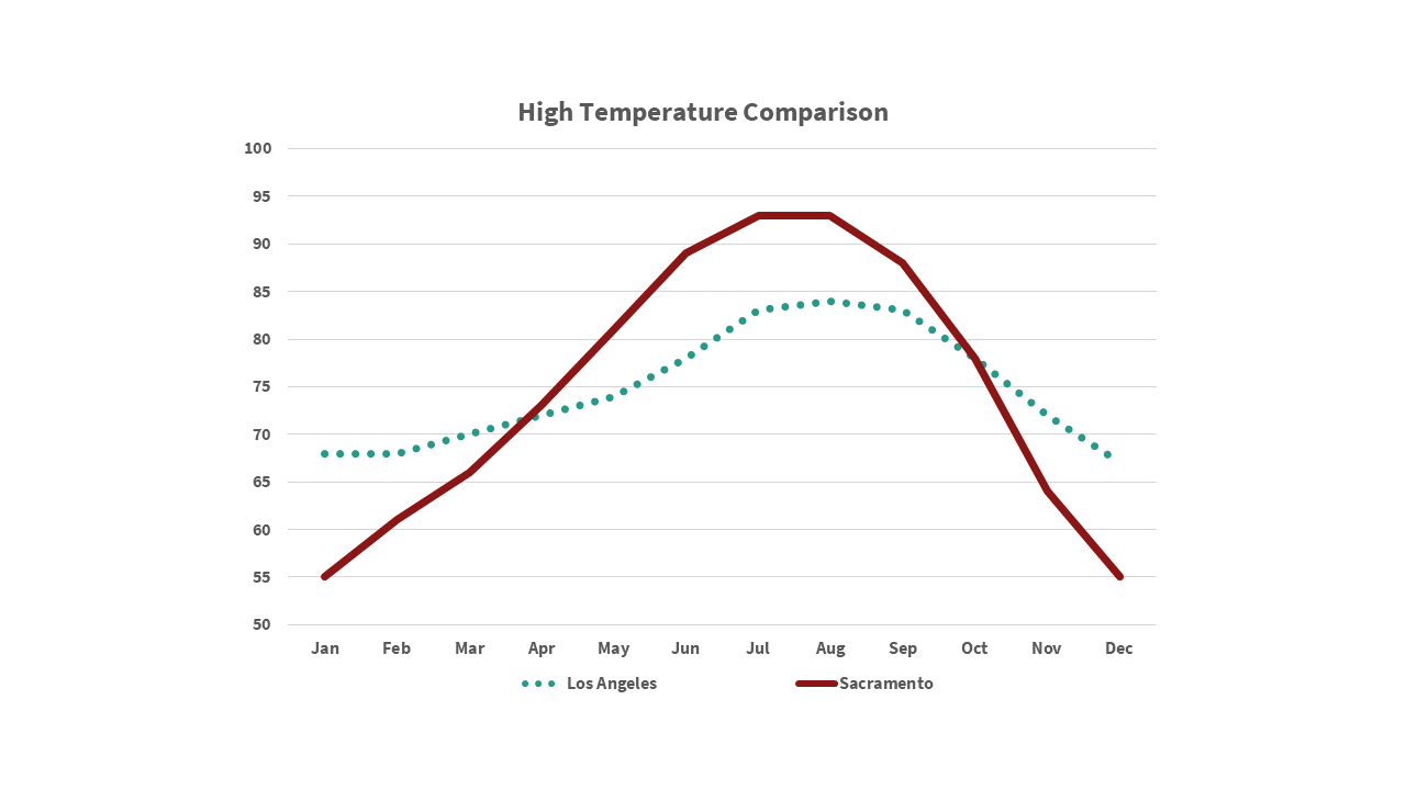
Another example is this line chart, where only color differentiates the two lines.
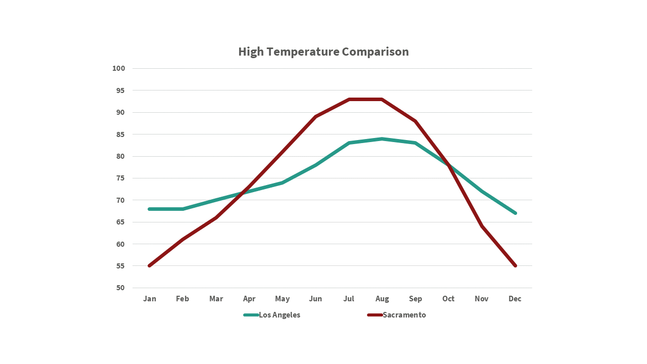
Changing one line to a dotted pattern makes the chart more accessible.