New Features to Help You Get (Even More) Excited About Slack’s Redesign
With the recent launch of the redesigned Slack last month, you may have found yourself surprised by the number of channels visible in the default “All workspaces” view.
Managing this unified view becomes more challenging as the number of workspaces to which you belong increases.
Fortunately, Slack’s redesign comes with new features to help you quickly tweak your settings, ensuring you can stay focused on the work that matters to you the most.
See only the channels in a specific workspace
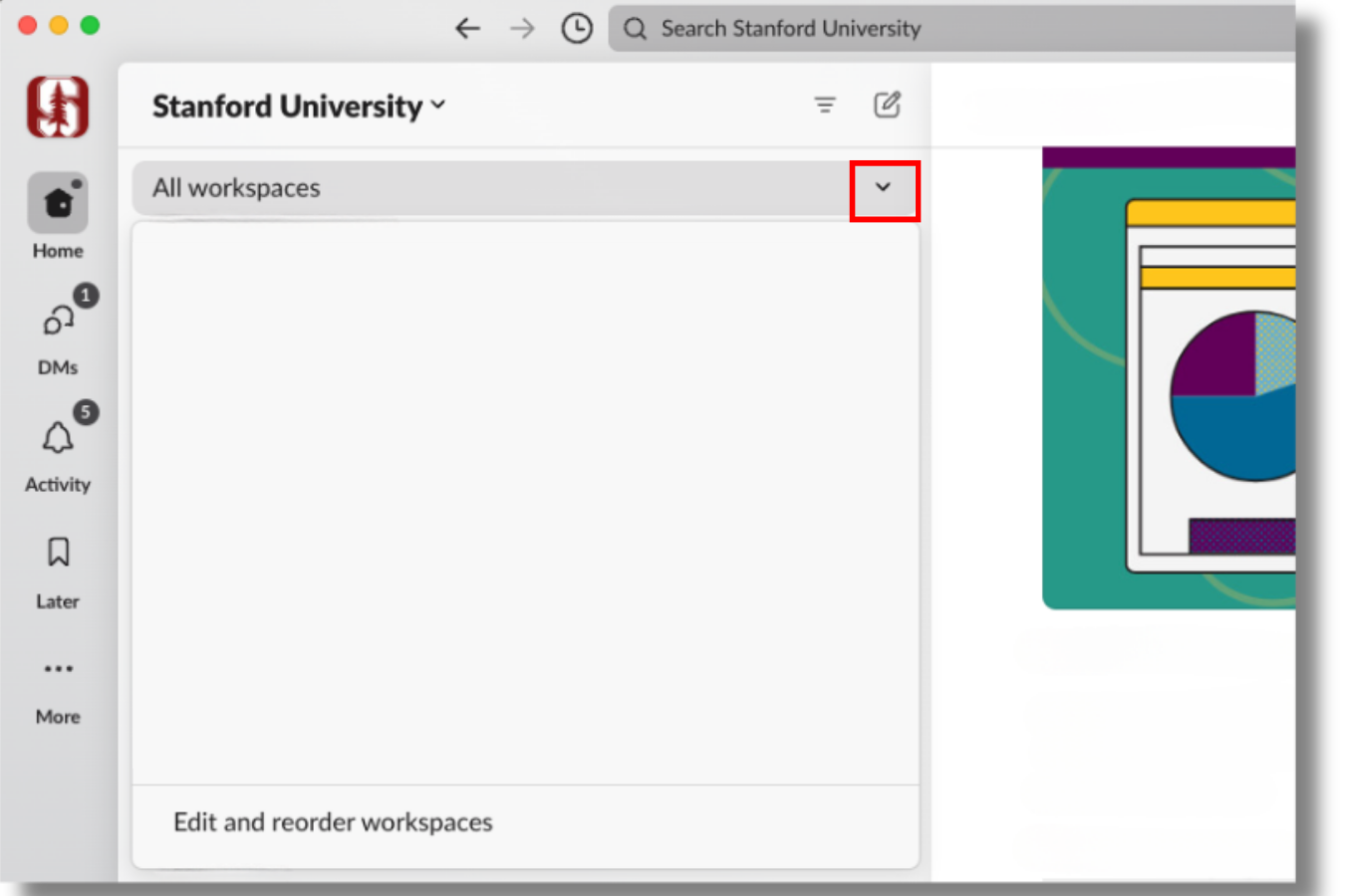
A new workspace filter lets you see only the channels within a specific workspace — similar to the legacy interface. Just click the “All workspaces” drop-down at the top of your sidebar under “Stanford University.” You’ll see a list of all the workspaces you’re a member of. Select the name of the workspace you want to access, and only the channels in that workspace will display in your “Home” view.
Show only unread messages
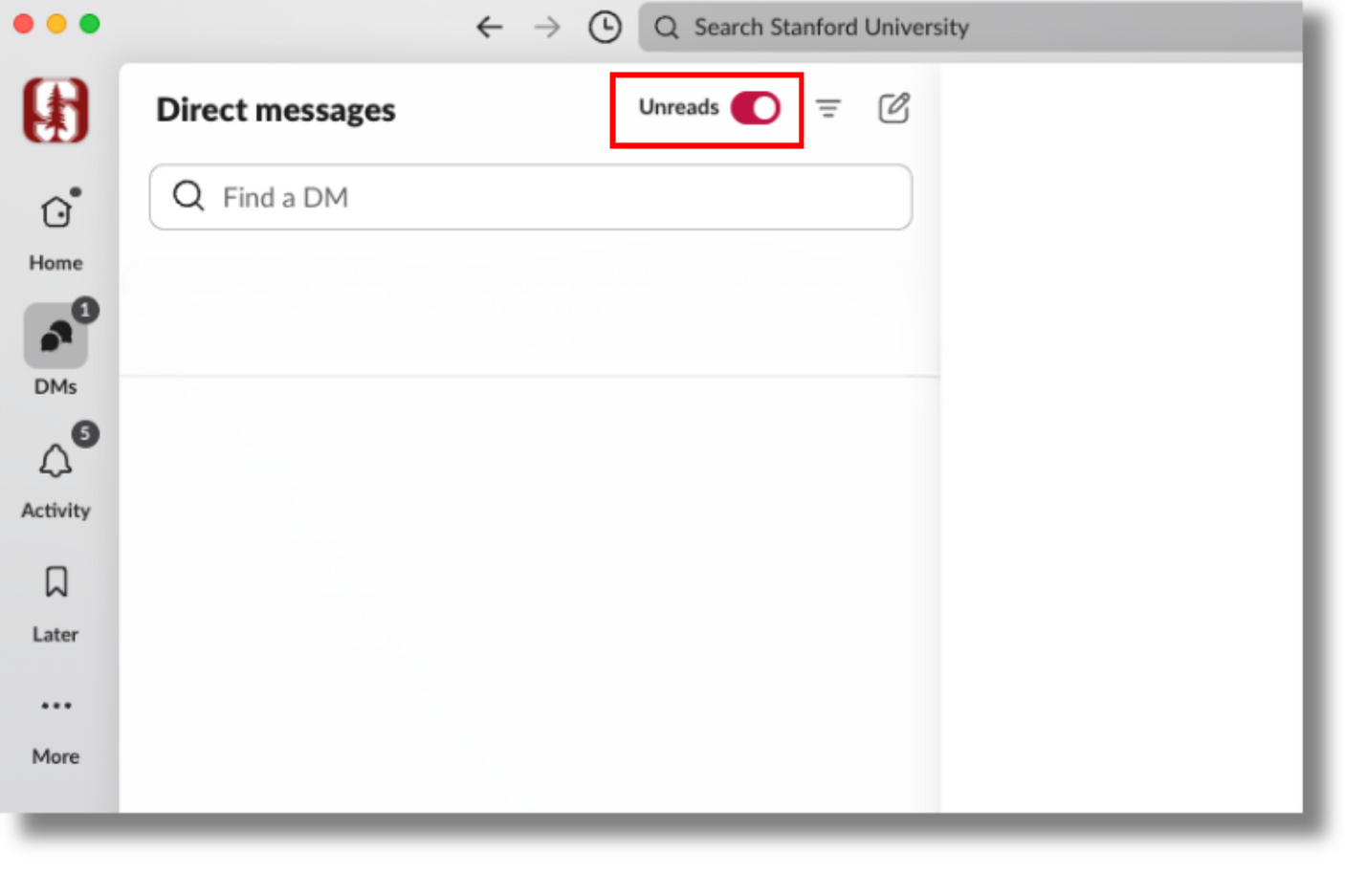
You now have a one-click solution to catch up on what’s new. From the DMs or Activity tabs, toggle to “Unreads” at the top of your sidebar. Alternatively, you can adjust your sidebar preferences, as you did before.
Filter the conversations you want to see
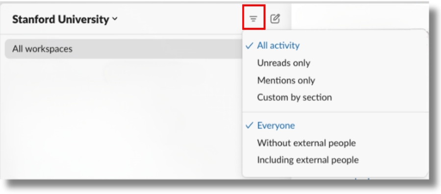
You can quickly filter the conversations you want to focus on. Follow these simple steps:
- From the “Home” tab, click the filter button at the top.
- Next, choose between seeing all channels, just the ones with unread messages or just the ones that mention you in a thread or DM.
Sort and filter channels, conversations, and apps by section
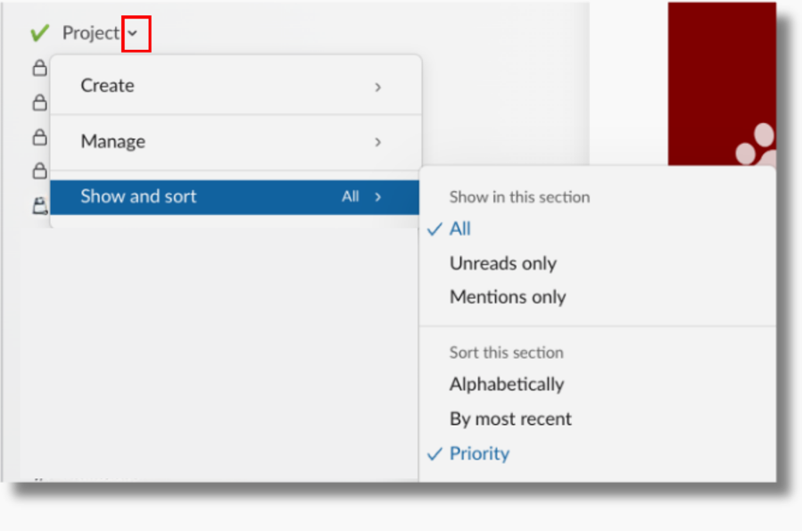
Discover a handy new feature that lets you fine-tune your display and sorting preferences for Starred conversations and each of the custom sidebar sections you’ve set up for your channels, conversations, and apps. This feature will override the display and sorting preferences you’ve set up for your entire sidebar. Navigate to the “Home” tab, and click the drop-down next to the section name. Hover over “Show and sort,” then choose your preference.
Pick your theme
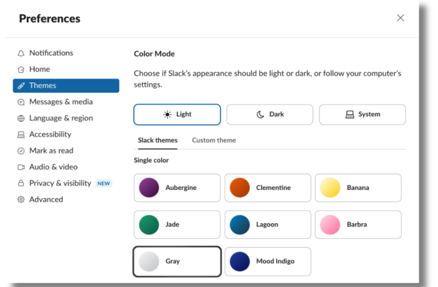
In the mood for a new palette to make your workspace easier on the eyes? The theme you were using might have gone away, but Slack now has a range of new color options plus adjustable brightness levels. Ready to switch it up? Click your profile image on the sidebar, select “Preferences,” and then choose “Themes.”
Keep your sidebar streamlined and organized
While we’re on the topic, here’s a friendly reminder that if you’re still grappling with channel and conversation management, a bit of cleanup might be in order. Here are some new — and old — features you can use:
- Set up custom sections to organize channels, DMs, and apps.
- Star channels and DMs to move high-priority conversations to the top of the sidebar.
- Edit and reorder workspaces to rearrange or hide a workspace from the filter. (Note: You can add the workspace back to the list later by using the search box if you need to.)
- Leave a channel if it’s no longer valuable to you. (Note: No one can leave the #general channel.)
- Mute channels you only check periodically.
- Archive channels you own that are no longer relevant.
Learn more
- Slack provides a couple of ways to help you determine a channel’s workspace.
- Need a quick reminder on where to find everything in the new sidebar? Take a tour.
- More questions? Check out the guide page, submit a Help request, or join the conversation in Slack at #slack-ama.
DISCLAIMER: UIT News is accurate on the publication date. We do not update information in past news items. We do make every effort to keep our service information pages up-to-date. Please search our service pages at uit.stanford.edu/search.
What to read next:
Approve Expense Requests on the Go

Be Aware: Rise in Phone Scams Mimicking IT Support

