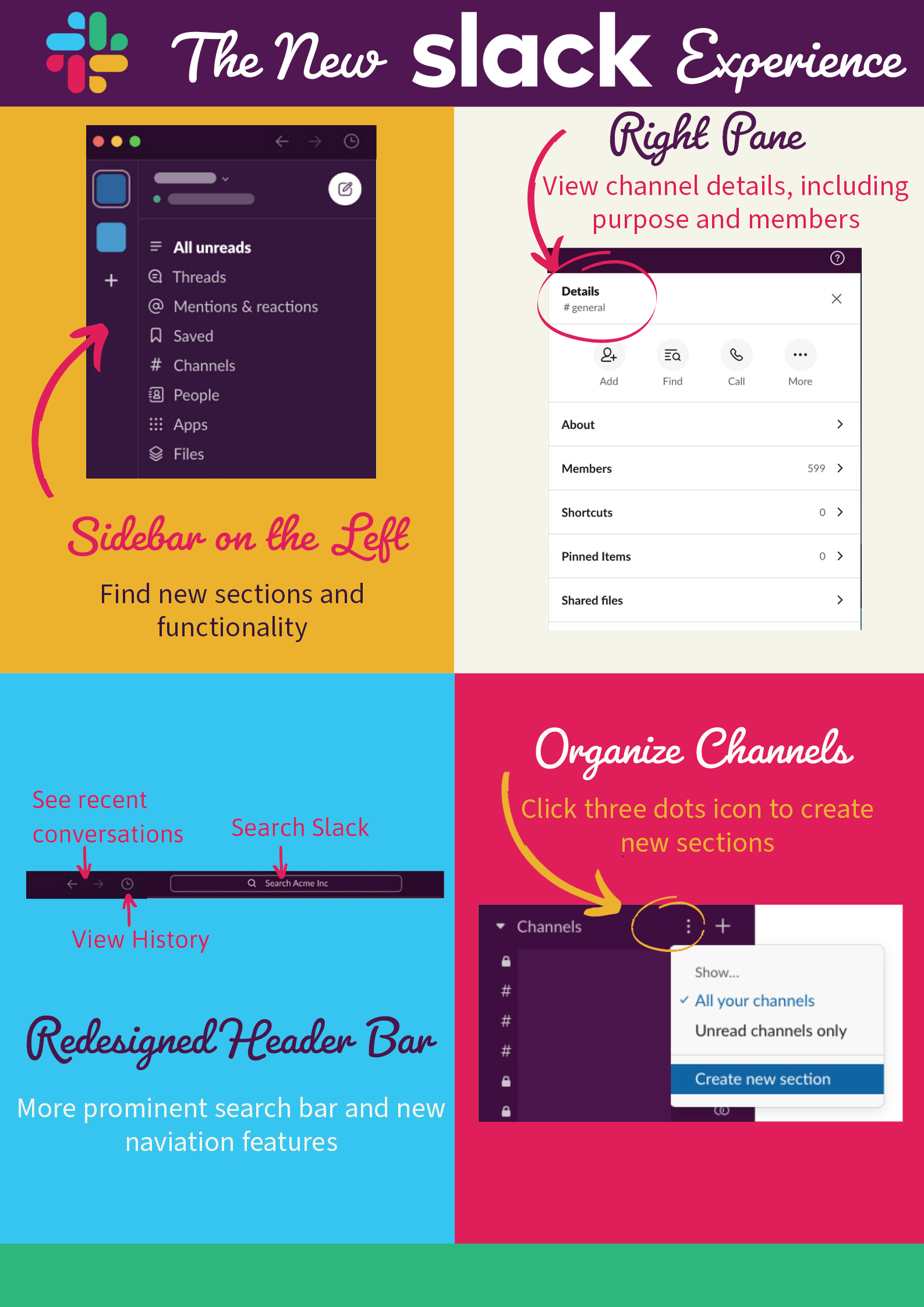
Sidebar on the left
Find new sections and functionality.
Right pane
View channel details, such as its purpose and members.
Redesigned header bar
Check out the more prominent search bar and new navigation.
Organize channels
Click three dots icon to create new sections.
While most Stanford Slackers have had a couple of weeks to get acquainted with the new interface, I’ve had a little longer. Along with other invited “Slack Champions,” I began test driving the refreshed platform in March to provide feedback to Slack. With that, I’ve had time to explore. Here’s a summary of what I like most and where I think there’s still room for improvement.
Navigation and new features
Header bar: Slack has streamlined the header bar and made the search box more prominent. To the left of the search box, I appreciate the left- and right-facing arrows that I can use to toggle between conversations. There's also a new drop-down History menu (similar to your browser history) that I am excited to start using more.
Top left sidebar: With channel details relocated to the right pane, the top left sidebar has been redesigned to house functionality many users probably didn’t realize existed before. Here’s a highlight of the sections and what I find most useful:
- Mentions & reactions: Now I can keep up with emoji responses to my messages.
- People: I love the new layout along with the filtering options and a dropdown menu to sort by people or workspace. But I do wish that the default view wasn’t all 39,000 members of the Stanford Slack grid.
- Saved: I like how Slack has separated the ability to save files and messages that are important to you from the ability to star people and channels. It’s a welcome improvement and the interface for this option was very nicely designed.
- Files: This feature is also much improved, although I’d like to see an option to view results in a compact row layout instead of cards.
Channel information: With the redesign, Slack reserves the right pane for channel details, which I think is a good way to go. I appreciate that you can click on a channel name and view channel details that were previously hidden in the left sidebar. I also like how the expandable menu options enable me to see the purpose of the channel and other information like the names of the channel members, the files shared in the channel history, and any pinned items.
Channel organization
Slack has made some significant changes to how channels display on the left sidebar. I like that I can expand and collapse the channel lists. And I like the little dialog box for the “+” button to create new channels quickly. It’s a very nice touch that you can hover over the "Channels" section title and click the corresponding three dots icon to create new Slack sections. You can then order and group channels to keep them organized in a way that works for you. Very cool.
But there are a few aspects to the way channels display in the new interface that I hope Slack will modify in the future.
- List shared channels separately: I’m disappointed that this sidebar option appears to be disabled because this was a handy way to distinguish between shared channels and workplace channels.
- Channels directory: I like the direction Slack is exploring for the channels directory. But I would like to be able to filter so I could search the channels for a particular workspace only. In fact, if the default view can be just workspace channels, that would be a huge efficiency win. My guess is that when someone is in a workspace, they’re looking for channels specific to that workspace and not every shared channel in the grid.
Overall, that’s my feedback for the new Stanford Slack experience.
Learn more
- New Look and Feel for Stanford Slack
- From the Slack Help Center: The new Slack experience
- Read more Slack blogs