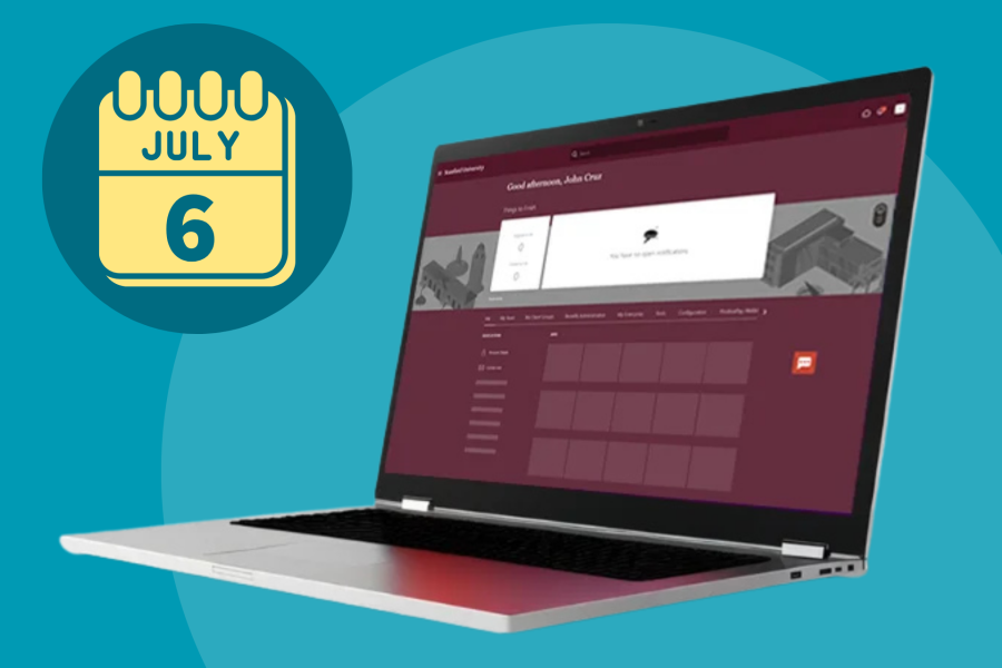
New Look and Feel for Stanford Slack
A redesign is coming soon to the Stanford Slack desktop and web app. But you won't see dramatic changes. Instead, you'll find several handy new features along with some existing features that have been organized in new places.
The update resembles a “spring cleaning” more than a major overhaul. But the end result is powerful, with added breathing room in the interface and a tidier, more elegant environment. Stay tuned for similar improvements to the mobile app.
Here’s a rundown of some of the key changes that will start to roll out to the desktop and web app beginning April 22.

Customize your sidebar
If you’ve been using Slack for a while, your sidebar may have become a little cluttered. The redesign solves that problem in a big way by letting you create custom sections that are visible only to you.
With an easy drop-and-drag action, you can group your channels, apps, and conversations into each section. This puts everything connected to a team or project in one place. To keep it minimalist, each section is collapsible with a folder look and feel. Of course, you can add emojis to your section names to help you quickly find what you need. And you can order sections as you see fit, so your top priorities can always live higher on the menu.
Find key information
New navigation at the top of your sidebar points you to key information. Click within this section to see your mentions and any reactions to your messages. Files, people, and apps are also there for easy referencing.
Introducing the compose button
New to Slack is the compose button, which you’ll find next to your workspace name. Click on it to start a message from anywhere in the app. You can begin composing your message even before you decide the person or channel you’ll send it to. Using this tool is a great way to ensure that you always send your message to the correct recipients.
And should you get distracted mid-message, no problem. Slack automatically saves any unsent messages in “Drafts” if you leave the page.
Lightning-fast access to your apps
A new lightning bolt is a shortcuts button that sits in the lower left of the message input field. Click the icon and you’ll get a pop-up menu of actions. From there, you can start a call, set a reminder, create a post, share a GIF, or launch an app. The lightning bolt is a convenient alternative to many of the “/” commands.
More critical functionality at the top
At the top of the Slack window, you’ll see a new navigation bar with an easier-to-find search field placed right over the center pane. The bar offers backward and forward buttons so you can toggle between recent conversations. And there’s a history feature that enables you to browse back through your activity.
What’s next
Slack hopes these improvements make it easier for all of us to stay organized as we work and make it easier to use some of the advanced functionality. For more details on the redesign, visit The new Slack experience.
What to read next:

New Smartsheet License Rate Announced
New AI Tools for Stanford Arrive June 30