 University IT
5 Steps for Designing Modern Website Navigation

Research shows that we have less than 20 seconds to grab the attention of users who come to our websites.
Stanford Web Services is here to help
Stanford Web Services provides a number of services to help you work through rationalizing your navigation (aka creating a sitemap), coming to understand your business objectives, and defining audiences and user needs, among other services.
Designing strong navigation is both an art and science in information architecture. It requires clear business objectives and a keen understanding of your users’ needs to build a seamless experience.
Users rely on navigation menus to understand the information landscape of a site, to find content, complete specific user tasks, and simply browse a website. Presenting your information through strong, calculated navigation is critical to making your websites effective for users.
A strong navigation system:
- Enhances the time users spend on our site to browse content. This experience meets the needs of users who may not be searching for specific details, but rather for an overall picture of information.
- Effectively communicates where users are on your website and where they can go. This guidance allows them to move freely between sections of content and find their way to previous pages.
- Reduces time to complete specific tasks, e.g. finding necessary information to apply to a department, school, or program.
Below are five steps to help you design a strong user-facing navigation. We’re also sharing research data and examples to help you modernize your navigation menu.
1. Make a list of all webpages
There are many approaches to designing navigation. We recommend that you start the process by doing a thorough content audit of all the information that’s on your current website, as well as information that’s intended to go on it — make a list of all webpages.
If you’re starting a website from scratch, draft an outline of all of the content you want on your website.
To get started, you can use a spreadsheet, sticky notes, index cards, or anything that helps you make and organize lists. Here are some templates to help you get started:
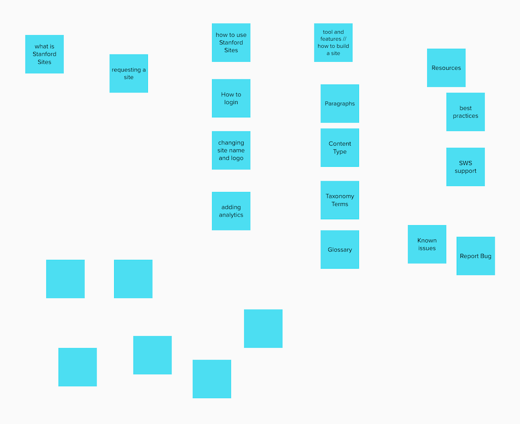
We used MURAL’s sticky notes to list out webpages. You can follow this sample project on our MURAL board.
2. Group content items into logical buckets
Now that you’ve created a “list of pages,” the next step is to organize this information. A great way to do this is by finding common themes within your content items and grouping your potential pages into logical buckets. This process of grouping “pages” into logical buckets will be the basis for your navigation.
We used MURAL’s sticky notes to organize and group content. You can follow this sample project on our MURAL board.
Tip: Think about logical buckets that are meaningful to your users. It will be easy to create categories that make sense to you as an organization, but remember that your users are the most important group that needs to understand and navigate through these categories. Using personas can help guide you through what a user might be thinking when navigating your site.
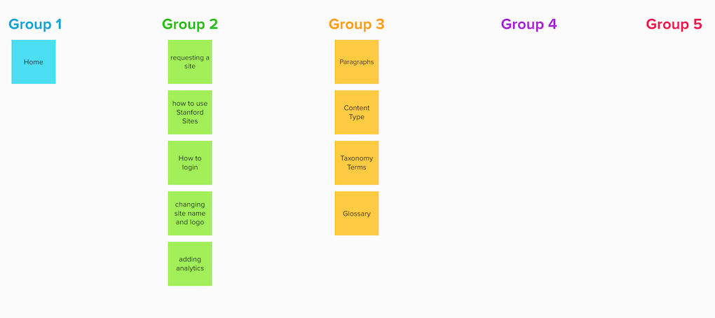
3. Create practical labels for the content buckets
When users land on your website, they tend to scan content before thoroughly reading it. So, it’s important to create a navigation menu that’s logically categorized with practical link labels. This makes it easy for your users to quickly scan through the information landscape, allowing them to better understand your website and think faster in terms of accomplishing their tasks.
We used MURAL’s sticky notes to group and label content buckets. You can follow this sample project on our MURAL board.
Tip: Link labels provide signals to users telling them how likely it is they’re on the right “scent”. Learn more about information scent.
The Four S’s of link labels
In their better link labels how-to, the Nielson Norman group recommends four guidelines for creating user-centered link labels. Links should be:
- specific
- sincere
- substantial
- succinct
Many factors can influence whether your link labels are intuitive. The key is to ask users, and ask often. Get the navigation in front of your audience, and get their feedback. (For more tips on how to test your navigation, see step 5.)

The navigation labels on the Carers Trust website are short, simple, and clear.
Make labels that are easily picked up by search engines
Consider label choices that your users would be thinking of when they’re searching for content. You might elect to rename your admissions process, the “request” process but "admissions" is a term that has become nearly ubiquitous in American culture. Using a different term will likely hurt your search engine rankings.
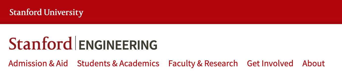
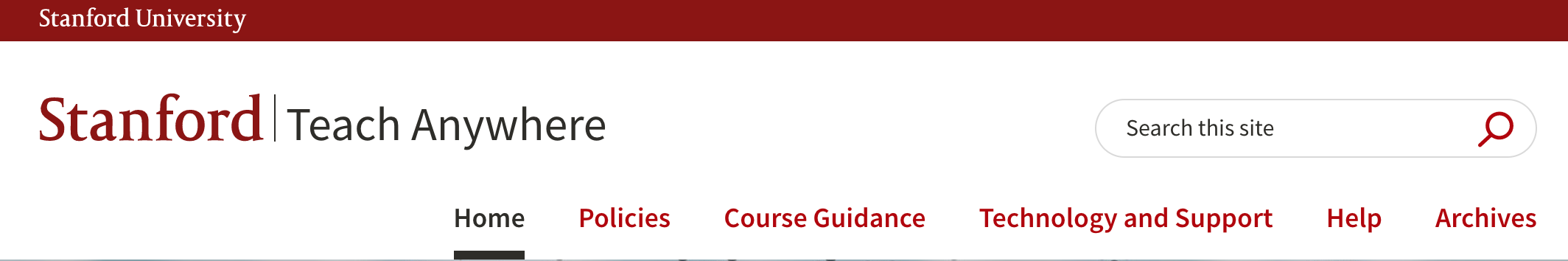
The navigation labels on the Stanford Engineering website are specific and use consistent grammar styling.
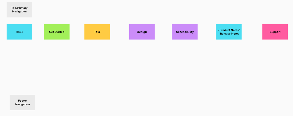
4. Prioritize content buckets
Prioritizing content buckets is like creating a table of contents for users. You’re establishing a hierarchy that funnels down from general overview (primary navigation,) to sub-menus, to specific content pages. You’re establishing a roadmap that is logical for the user to follow.
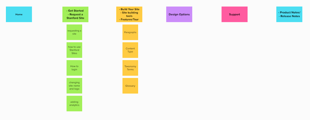
We used MURAL to prioritize content buckets. You can follow this sample project on our MURAL board. You can also follow our sample project in Google Sheets.
Design a primary navigation that is informative, not overwhelming
It can be tempting to add nine, 10, or even more links to your primary or top-level navigation — those links that sit in your header. It can feel like every category is critical for your users to discover the content, but this isn’t always true.
Unlike the length of sub-menus (which can have a high number based on your content), the number of primary navigation items is important to the users’ success completing their tasks. A general rule of thumb when designing a primary navigation is “not too many, not too few.”
An abbreviated version of Stanford Web Services test plan and results for Stanford Sites User Guide. You can follow this sample project in Google Sheets.
Tip: Consider making tough cuts, and highlighting the buckets the main audience wants and needs most— anywhere from three to eight menu items seem to be about right. Fewer than three, and users may be confused by overgeneralization.
For example, on a department site, “Academics,” “Research,” and “About” may not be specific enough. But more than eight categories likely means there is category overlap. (Don’t forget about your footer! You can use it for categories or links that don’t make the main navigation cut.)
5. Test it!
“Intuitive navigation doesn’t happen by chance!” It requires thoughtful planning on your end, but more importantly it requires validation from your users.
The absolute most critical part of successful navigation is testing it. That doesn’t mean you have to embark on a lengthy, complex process. In fact, this should be one of the easiest parts of creating navigation.
When we tested the navigation for our Stanford Sites User Guide website we learned three important things:
- Users expected to see content under the “Tour” and “Get Started” pages.
- The term “tour” implied there would be some sort of video or guided tour of the platform.
- Users expected to find some of the how-to content in the “Design” section of our site.
The test helped us uncover some challenges users may face with our current navigation. To address these challenges, we will use a card-sorting exercise with our internal team to help determine better labels and/or locations for our content. If time permits, we will repeat the card sorting exercise with new Stanford Sites users before making any changes. Once we implement changes to the navigation, we will do another round of testing.
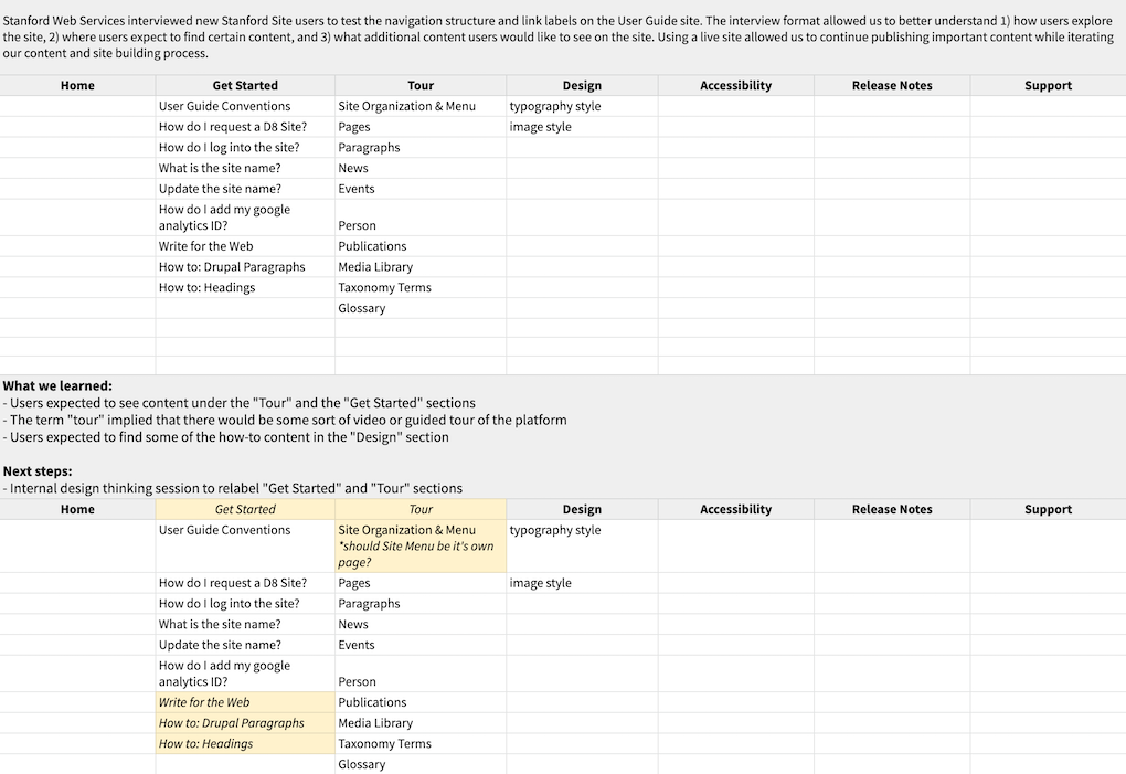
An abbreviated version of Stanford Web Services test plan and results for Stanford Sites User Guide. You can follow this sample project in Google Sheets.
Tip: We really like techniques and tools that allow users to get a contextual feel that is relevant to a website experience.
Cafe testing: Take your sitemap or prototype to others in your organization or to a café with people who may be unfamiliar with the website, and ask them what they would do to complete top “tasks.” Tasks are common questions that users are trying to accomplish by seeking content on your site. For example, “how do I apply?” Learn more about creating user tasks.
Treejack: a tool that allows you to easily import the sitemap, include tasks, and then test.
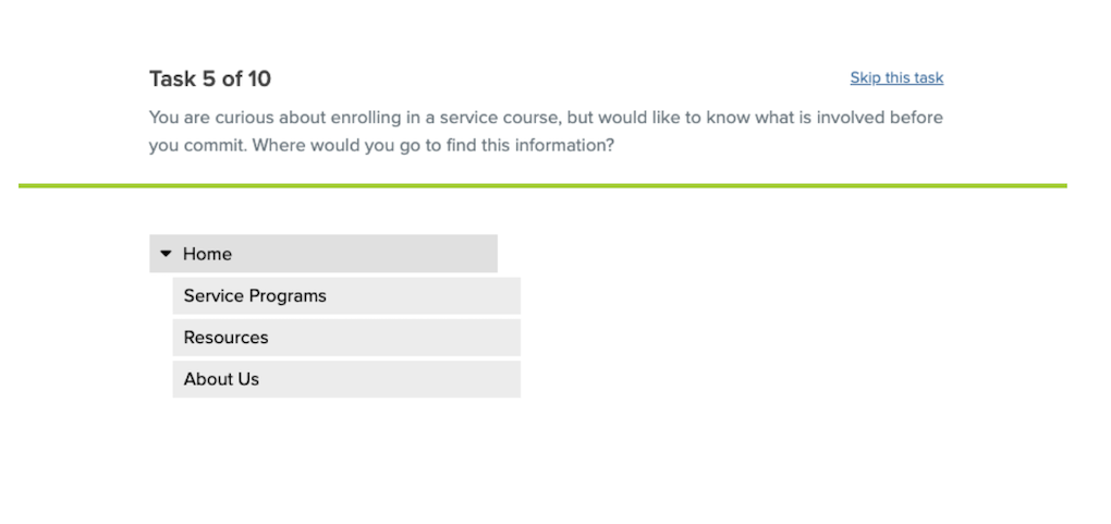
SWS used this tool to test the navigation design for the redesign of the Cardinal Service website.
Userbob: an affordable tool that allows the testing of prototype sites, where the experience is even more intuitive. Again, just come up with top tasks for your users to navigate.
Learn more about designing good navigation
We recommend reviewing A Brief Overview On Responsive Navigation Patterns as it lists ways to optimize your sitemap and why, explains the purpose of navigation, and offers in-depth information about optimizing mobile navigation.
There are a time and a place for creating drop-down menus to help users navigate your website. Read our blog post When and How to Use Drop-down Menus for more information.
What to read next:
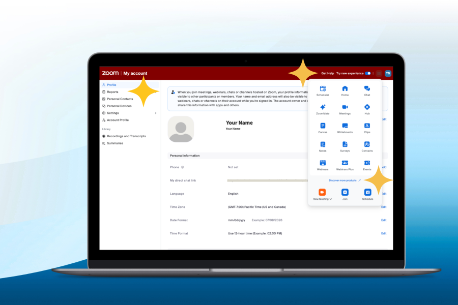
Navigation Updates for Zoom Web Portal Coming Soon
