Today’s release of Stanford Mobile was the first with a sole focus on improving the student experience. Through newly established campus-wide partnerships — including those with students — we learned what enhancements to the existing implementation would be most beneficial to the home screen’s layout, function, and content strategy.
Our goal of this release was to kickstart the effort of providing contemporary and expanded mobile application functionality to enhance student engagement and improve students’ experience of various information systems, laying the foundation to enable campus partners to provide enhanced, secure, and low-risk mobile functionality to better support the Stanford community.
Here’s an overview of what’s changed with our first release:
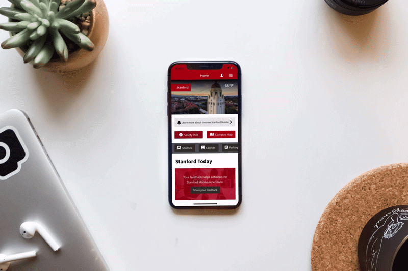
The home screen has been completely redesigned, with a primary focus on prioritizing content based on the findings thus far from the discovery and engagement efforts with students.
Navigation
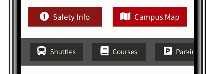
Scrollable button navigation makes it easier to quickly find content of interest with a swipe of your thumb.
Spotlighted content
Important and more timely content now has a dedicated place on the home screen.
Dining options
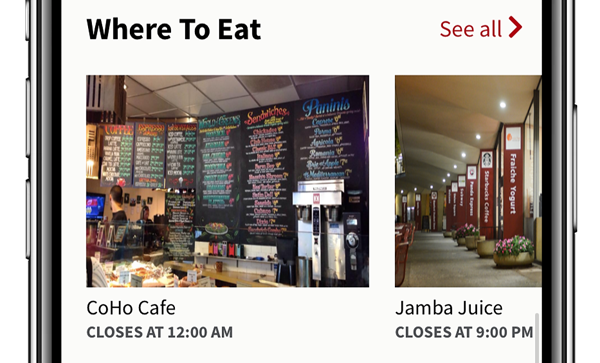
Popular dining options are spotlighted, allowing you to instantly see if popular eatery locations are currently open, while also granting quick access to more information for each location.
Events and news
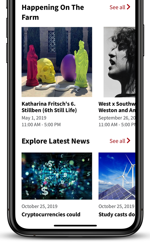
Upcoming campus events and most recent Stanford News stories are featured so that you can effortlessly explore events and news pieces that may be of interest.
You can view a full list of release notes at https://uit.stanford.edu/stanford-mobile/release-notes.