The Impacts of CSS on Accessibility
Cascading Style Sheets (CSS) are used to change the presentation of HTML content. Inherently, CSS is not designed to change the semantic meaning of content, but to control its appearance. It allows the presentation aspect to be separated from the structural information. Because most web developers understand this concept from early on in their careers, it can be surprising to learn about the ways CSS can both enhance and hinder the accessibility of web content. Often we think of accessibility in web content as being mostly about the HTML structure, such as landmarks, headings, and form field labels. So let’s first cover some of the most common ways to use CSS to enhance accessibility. We will then cover ways CSS negatively impacts accessibility and some surprising cases where the presentation vs. structure divide can be breached.
CSS techniques for enhancing accessibility
Some of the simplest ways to use CSS for accessibility include:
-
Ensuring all font color choices have sufficient contrast with their background colors. The Web Content Accessibility Guidelines (WCAG) standard for minimum contrast is 4:5:1 for small text and 3:1 for large text. You can our Interactive Color Chart Tool to check the contrast ratios of different color combinations from the Stanford Identity Guide.
- Choosing easily readable and consistent typefaces and fonts. Very small text, thin strokes, and too much use of bold, italics, or capitalization can all make content harder to read for various audiences. You must also ensure that text resizes as expected when users zoom in using their browser. This includes using relative font sizes and ensuring that content containers resize and reflow as needed to prevent content from overlapping, getting cut off, or being removed. Avoid using
overflow:hiddenas this causes content to be clipped when it exceeds the padding edge of its container.
More advanced techniques include:
-
Adding text that is positioned off-screen to clarify link text or button labels. For example, if you have multiple “Learn more” links on a page, you can embed visually hidden text within the link to clarify the target destination. (However, it is generally better to add the clarifying text visually to benefit all users when the design allows it.)
-
Using CSS-positioned off-screen live regions to announce changes. For example, if you have a search page that dynamically updates a list of results when a user interacts with filters, you can add a
<div>or<span>that is positioned off-screen to contain updates about what change occurred. If you addaria-live="polite"orrole="status"to the<div>or<span>then the updated text will be announced automatically by screen reading technology. -
Ensuring active elements (links, buttons, form fields, etc.,) all have a clearly defined focus indicator when someone uses their keyboard to tab through the page. Browsers have their own native focus indicator, but it is not always obvious depending on your website’s colors or other design aspects. You can use CSS to create your own focus indication that is highly visible for keyboard users.
CSS techniques that hinder accessibility
-
Hiding important information like form labels or fieldset legends with
display:noneorvisibility:hidden. Using these CSS properties hides content both visually and programmatically from assistive technology. While your design may call for hiding these pieces of text, it is typically better to have them always displayed as they benefit all users by making the purpose of fields clear and explicit. -
Failing to use
display:nonewhen it actually IS appropriate for visually hidden content. When there is content on a page that is conditionally revealed, such as when opening a menu or expanding an accordion, the hidden content should be completely hidden withdisplay:noneorvisibility:hidden, NOT just positioned off-screen. Positioning content off-screen in these cases can result in assistive technology users, such as sighted non-mouse users and screen reader users, encountering the content when they shouldn’t. If a sighted keyboard user lands on links that are positioned off-screen they will lose track of their location on the page and have to spend extra time navigating. -
Removing focus outlines with
outline:none. Since we already mentioned the possibilities of setting your own custom focus indicators, we’ll give a reminder that removing the browser default outlines without setting something new should absolutely be avoided. Sighted keyboard-only users will not be able to track their location at all. Many third party libraries do this by default, so check for this when incorporating anything you didn’t develop in house. -
Reordering the display of content without considering its underlying DOM order. Though you can use CSS to layout blocks of content in any order you want, it is important to order the HTML content logically. Screen reading technology typically renders content to users in the order it occurs in the DOM. If that order does not make sense, regardless of what you’ve done with the CSS, you are presenting users with a different (and potentially confusing) experience when compared to sighted users who are presented with the visual order you’ve created with CSS positioning. For example, if you have flyout menus, these should not be positioned at the bottom of the code, but rather inline with the controls that reveal them so that screen reader users can encounter them in the logical flow of the page instead of missing them due to them being far removed from their visual insertion point.
-
Adding visually meaningful styles to generic HTML elements rather than using the appropriate semantic element. For example, you can add styles to a
<span>or a<div>to make its text content look like a heading, but that does not cause the browser or screen reading technology to perceive and render that text as a heading to users. The meaning you are visually communicating with styles will be lost. Since browsing by headings is an important navigation method for screen reader users, ensure you apply your styles to appropriate heading elements.
Surprising failures of the CSS structure vs. presentation divide
There have been interesting cases where the intended divide between structure and presentation is breached in unexpected ways by CSS properties, particularly in how screen reading technology renders content to users. Sometimes these issues only occur in a specific browser and screen reader combination, sometimes in multiple. Being aware of a few of these will help you avoid them specifically, or serve as a jumping-off point for noticing and troubleshooting strange behaviors yourself. (Note that browser behavior and the status of these issues as accessibility concerns can change over time, so always research the current state of behavior, or ask the Office of Digital Accessibility to confirm).
-
Using
list-style:noneon lists. Using this declaration causes the list semantics to be removed when someone is reading the page in Safari with the VoiceOver screen reader. The user will not hear that the content is a list or the number of items. Depending on the content this may be fine, or it may be a real annoyance to not hear the content conveyed as a list. -
Using
display:block,display:grid, ordisplay:flexon<table>elements. All of these declarations at one point caused the table semantics to be removed in various browsers. Over time this has been fixed in Chrome, but issues persist in Firefox and Safari. Because screen readers provide special navigation methods to read and understand tables more easily, the removal of the semantic table meaning can be very detrimental to screen reader navigation. -
Using
appearance:noneon<input type="checkbox">. When using NVDA with Firefox this declaration causes the semantic meaning of the checkbox to be removed. NVDA will only render "blank" for this input rather than stating "checkbox".
Conclusion
CSS plays an important role in the accessibility of web content. As you are developing a site, consider how the styles you are implementing may help or hinder accessibility. If you have something that is not behaving as expected when you test it for accessibility - try abstracting it temporarily from its CSS and gradually layer the styles back in to see what happens. If you have questions about how your CSS may affect the accessibility of your site, please reach out to the Office of Digital Accessibility for a consultation.
What to read next:
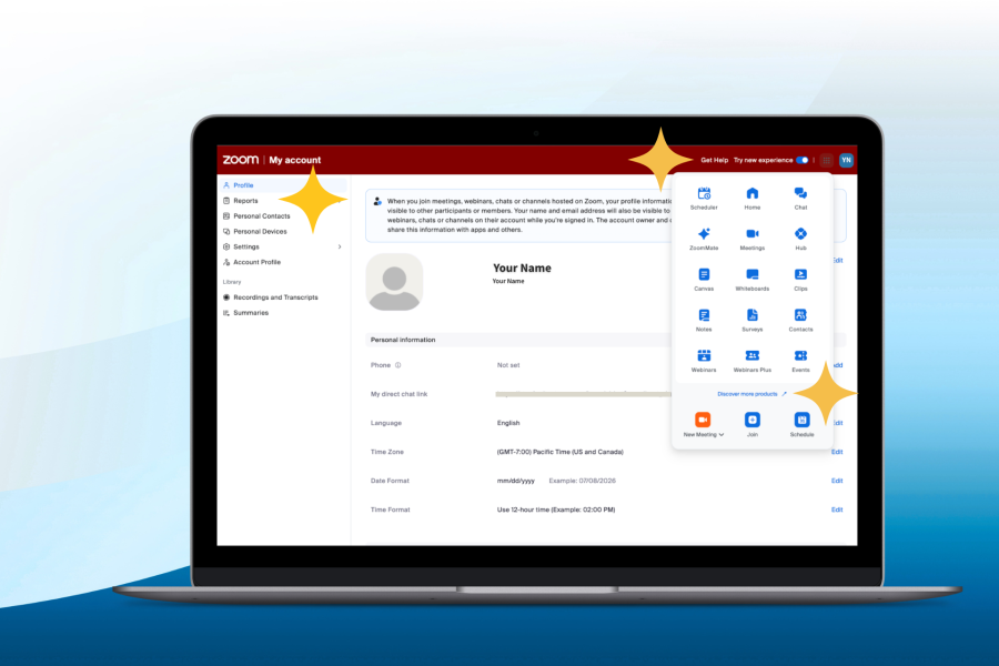
Navigation Updates for Zoom Web Portal Coming Soon