Axess Refresh
Axess Refresh Overview
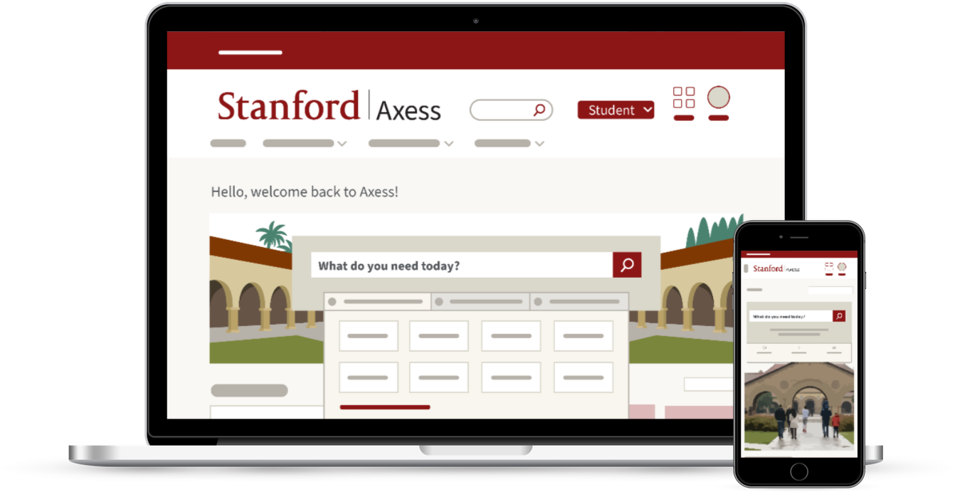
Axess Refresh is a project designed to improve how Axess looks and works, while still maintaining the features and tools we all rely on.
The updates included in this project make Axess more user-friendly now and more adaptable for the future.

About the Updates
Axess Refresh brings you an improved interface and modernized backend. Major updates include:
Modern look & feel
The new Axess interface has a modernized look and feel with enhanced layouts for key pages. The Axess Refresh also makes certain pages and tools more mobile-friendly.
Improved navigation & new search
More intuitive navigation options make it easier to find what you need, when you need it. Plus, a new search tool is available for quick lookup.
More custom features
The Axess Refresh update gives you more personalized options, such as the ability to toggle among your available roles at Stanford (student or employee, for example) to view relevant information.
What's New For You?
The Axess Refresh gives you the ability to have a customized, streamlined experience based on your role at Stanford.
See what's new, based on your role (or roles) at Stanford, in the short videos below.
Open each role to view a short video:
Students can expect a new search tool, improved navigation menus, personal saved links, and a new way to enter and share your pronouns.
Watch this short video to learn more:
Instructors and advisors can expect a new search tool, improved navigation menus, personal saved links, and the ability to toggle between Stanford roles if applicable.
Plus, the new Axess experience comes with a way for faculty to view students' pronouns in class and grade rosters, for students who choose to enter and share their pronouns.
Watch this short video to learn more:
Employees can expect a new search tool, improved navigation menus, and personal saved links you can customize.
Watch this short video to learn more:
Axess Refresh Fast Facts
Learn more about the Axess Refresh project.
Quick Background
-
AUGUST 9, 2022Axess Refresh updates are released for all Axess users
-
2021The Axess Refresh project began development
-
2020UIT conducted an assessment for opportunities to modernize Axess
-
2013The last time Axess underwent significant updates
What You Should Know
For general users:
The Axess Refresh changes are designed to improve your Axess experience overall. Training is not required. Simply enjoy the new and improved Axess!
For Axess power users and certain business offices:
Some users in specific roles at Stanford might need additional orientation to the new look and feel. UIT has been coordinating with these offices and individuals to provide updated documentation and resources.
Frequently Asked Questions
- Why was Axess updated?
- Axess Refresh is a project that went live on Aug. 9, 2022, to apply important visual and technical updates to Axess, making the experience better for everyone at Stanford. The refresh also makes Axess more sustainable for the future, as the portal had not been significantly updated since 2013.
- Is this update opt-in or does it happen automatically?
- This update was applied Aug. 9, 2022, at the same time for everyone at Stanford. There was no early opt-in process or opt-out process.
- Did this update involve any service down time?
- Yes, Axess was unavailable for maintenance between 5 p.m. PT Friday, Aug. 5 and 8 a.m. PT Tuesday, Aug. 9 while the changes were applied. Updates are now available.
- Is the Timecard for employees changing at all as part of this update?
- No, the Timecard form and process is not changing as part of this Axess update. Employees can find the Timecard link from the new Employee Center homepage or using the search tool.
Get Help
For assistance with the new Axess portal, please submit a Help ticket.
