Paying particular attention to typography can make your documents and web pages more accessible. While most items in this post do not directly map to any Website Content Accessibility Guidelines (WCAG) criteria, they are all best practices for creating accessible content—instead of just compliant.
There are no hard and fast rules for all the following best practices, and there are certain instances when they should be ignored altogether. However, if you follow these guidelines, your documents and webpages will generally be more accessible for all your users.
At the end of the day, type and legibility is about the reader’s preferences. Everyone reads most effortlessly in the format that they’re most comfortable in and it is our duty to ensure that we provide the most flexible and universal format for users. There are also times when specific formatting is required which overrides considerations in this document, such as when your document is required to meet MLA or APA styles.
All that being said, we will go into more detail about the following best practices:
- Avoid all caps (and small caps)
- Avoid excessive italics and bold
- Avoid using underline
- Avoid using strikethrough, superscript, and subscript
- Don’t justify text
- Choose easy-to-read fonts
- Select an appropriate font size
- Select appropriate special characters
- Consider line length
Avoid all caps (and small caps)
People read by the shape of a word first, and the letters second. WHEN YOU WRITE IN ALL CAPS, EVERY WORD IS THE SAME RECTANGLE SHAPE. The same issue arises when using small caps. Words in small caps are the same shape. All caps and small caps makes it difficult for certain users to read you content correctly. Additionally, screen readers read all/small capped words as acronyms, misinterpreting content.
With regular case, each word takes on a distinct shape, enabling them to be understood individually by users and screen readers.
Comparison
Read the following passage in call caps:
Now, read the same passage in regular case:
Which passage was easier for you to read?
It’s best to keep all caps to a minimum, but if you must use all caps, be strategic about how and when you capitalize entire phrases/words. For example, having headings in all caps wouldn't be a major concern, but having whole paragraphs, or even sentences in the middle of a paragraph, in all caps would be.
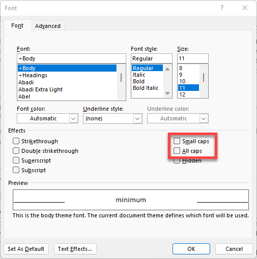
Programmatically all capping your text rather than typing each letter with the shift key down is preferable for screen reader users. You can all cap your text in MS Word using the font menu. Select the “All Caps" option.
For HTML, use the text-transform property.
<p>DON’T DO THIS!</p>
<p style="text-transform: uppercase;">Do this instead if you must.</p>
Avoid excessive italics and bold fonts
Italics and bold are great for emphasizing keywords or points in a document but are not always accessible. First, by default, screen reading programs will not inform the user of any words in bold or italics; therefore, this group of users could miss important information or context. When reading through your content, ask yourself, “Does this still make sense if I do not see the bold or italic text?" You may need to rewrite your content or present the information differently.
Second, it is very easy to overdo bold and italic text for emphasis. This can be problematic for all users, especially those with neurodivergent issues. If every other word is emphasized, the user is less likely to understand any of your content, let alone the parts you’ve stressed. Therefore, it’s best to keep your use of bold and italic text to a minimum.
Special note for web
On the web, unlike programs such as MS Word, there are a few ways to bold and italicize text that have different results and meanings:
- CSS (
font-weight: bold:andfont-style: italics;): Using CSS to change the style of an element, such as<span style="font-weight: bold;">Bold</span>is purely decorative. <strong>and<em>: These stand for “Strong" (bold) and “Emphasis" (italic), and unlike the CSS technique, these carry semantic meaning. In other words, use “Strong" and “Emphasis" if you want your bold and italic text to be conveyed to a user. Again, it’s best to keep bold and italic text to a minimum.<B>and<I>: These stand for "Bring Attention To" (previously refereed to as "bold") and "Idiomatic Text" (previously refereed to as "italic") respectively. Previously these had no semantic meaning, but now these elements do carry a semantic meaning in the same way that<strong>and<em>do. But even so, rarely will a screen reader present to the user any information about these elements.
Avoid using underline
For electronic documents, underline conveys a specific visual meaning: underlined content is a link. Using underline for emphasis was a workaround for typewriters that couldn’t do italic or bold and was rarely used in traditional publishing to bring emphasis to words.
Underlining in place of italics or bold in your digital documents can cause confusion, especially for those with cognitive disabilities. They expect an underlined word to be a link. So be honest—did you consider clicking on the word “underlined" in the first part of this section?
Avoid using strikethrough, superscript, and subscript
Like bold and italic, there is also strikethrough, superscript, and subscript. And like bold and italic, this information, by default, is not presented to screen reader users. In Word and other Office documents, there is no way for characters encoded with this information to be read to the user; the content is simply read as normal, which can be confusing. For example, take this sale-priced item from a well-known clothing website:

When a screen reader user gets to the price area, they will be read $90, then $30. The user will not know which is the correct cost. Unfortunately, there isn’t a simple way to make strikethrough text accessible for most documents. It’s best to avoid using strike-through in this context altogether or rewrite the content.
For the web, this is where ARIA can come into play. For example, on the above-priced item, you could use ARIA to identify the two different costs:
<p aria-label="Original Price $90.00"><strike>$90.00</strike></p>
<p aria-label="Sale Price $30.97">$30.97</p>
You will sometimes have entire passages struck out (deleted without removed) or inserted for legal documents. In that case, use the <del> and <ins> elements respectively. While this information will not be presented by default, similarly with the use of <strong> and <em>, the struck-out text would be conveyed to the user.
The same is true for superscript and subscript. For example, a price could be written as $999 using superscript, but that will be read as almost $999 rather than $9.99. As before, using an aria-label attribute could be appropriate, or in this case, consider putting the decimal in only for screen reader users (by moving it off screen) with something like this:
<p>$9<span class="sr-only">.</span><sup>99</sup></p>
This is not to say that strikethrough, superscript, and subscript shouldn't be used, but understand that the information presented in this way will not be conveyed to assistive technology users.
Don't justify text
Justified paragraphs, where a paragraph's left and right edges align with the edges of your page or document, can create issues for people with disabilities. To make both edges align, the software adjusts the size of the spaces within the sentence to be larger or smaller than normal until the last letter of the line is aligned to the right edge. Are you confused? So are users with cognitive disabilities like dyslexia. As a result, the text can become difficult to read and comprehend and is even worse on a mobile device.
Comparison
Compare the following two passages:
Do you notice the unnaturally large spaces in many of the lines of the text in the first paragraph? Out of the two passages, which is easier to read? The first passage is justified to the left edge. This formatting added additional spaces that make the text harder to read.
Choose easy-to-read fonts.
Your fonts should be easy to read and understand. While that seems like a simple statement, there is a lot of debate about what that means. Among designers, the discussion between serif and sans-serif fonts is just the tip of the iceberg regarding what is better for readability. There are issues of height difference between lower- and upper-case letters, the spacing between letter combinations, the distinctiveness of certain characters, and more.
When it comes to what constitutes an accessible font, there is a similar debate with no clear consensus. A quick web search recommended the following:
- Siteimprove: Tahoma, Calibri, Helvetica, Arial, Verdana, and Times New Roman.
- ReciteMe: Arial, Calibri, Century Gothic, Helvetica, Tahoma, and Verdana
- PennState: Verdana, Lucida Sans (PC)/Lucida Grande (Mac), Tahoma, Georgia, Palatino (Mac)/Palatino Linotype (PC)/Book Antiqua (PC), Andika
This list shows that no one has a clear idea of the best font for accessibility. However, all these fonts have clear characters with easy-to-read elements.
Here at Stanford, the official fonts in the Stanford Identity Guide are Source Sans Pro, Source Serif Pro, and Roboto. All these fonts are excellent choices for accessibility (and brand compliance), so we recommend these fonts be used in most cases.
Also, when choosing your fonts, be sure not to select font faces or variations that are very lite (have thin lines). These can be problematic, especially at smaller font sizes. Instead, choose regular weight for most uses and lightweight and bold for certain accents.
For more information on fonts, check out Gareth Ford Williams' article "A Guide to Understanding What Makes a Typeface Accessible."
Special note for web
While not possible for most Word, PDF, and other documents, the font can actually be changed by the user on the web. What works well for you might not work for everyone. For example, some fonts are designed specifically for people with dyslexia, such as OpenDyslexic. However, even among those with dyslexia, there isn’t a consensus that this font helps with understanding and readability. In fact, some with dyslexia find the font Comic Sans to be the easiest to read. It is not necessary to build a mechanism that facilitates changing your site font, but don’t do anything to prevent changing a font either (like using the “!important" declaration on your font face in your CSS file).
Select an appropriate font size
Tiny fonts are difficult to read. While there are techniques that a user can use to increase the font size of a document, they shouldn’t have to read the content. While there are no hard and fast rules when it comes to font size, these are generally the best practices for minimum size fonts:
- Word, PDF, and other documents: 12pt (pt = point)
- PowerPoint: 18px for online, 24px for in person (px = pixels)
- Web: 16px (this translates to about 12pt on the screen)
Special note for web
More importantly for the web than using any particular font size, is that you use relative sizing for your fonts rather than fixed sizes. Using
Select appropriate special characters
Numerous special characters have different meanings, especially for screen reader users. Take the following, for example:
5 x 2 - 3 = ?
That will be read to the user as “Five X Two Dash Three Equals Question Mark". Even when substituting special characters for the math symbols, the content looks similar to the original example:
5 × 2 − 3 = ?
But this will now be read as “Five Times Two Minus Three Equals Question Mark" which completely changes the meaning of the content to be more accurate. In HTML, this would look like this:
<p>5 × 2 − 3 = ?</p>
To insert a special symbol in MS Word and other office products, you go to the Insert tab and select the insert symbol command. Special characters pop-up menu will appear. Select a special character. The menu will tell you exactly what that character means.
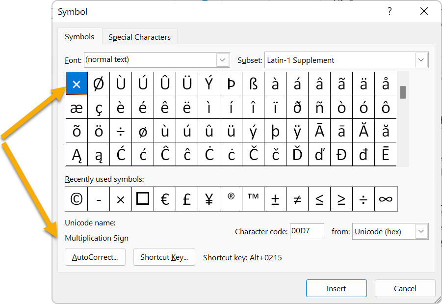
In HTML, there are also many different characters available. A full list can be found on the Unicode Table website and some of the more commonly used characters can be found on this W3C page. Note for HTML, there is often more than one way to insert the same character. For example, both © and © will insert the © symbol.
It is important to note that while not every character will be read properly to a screen reader user, using the correct character has a much better chance of it.
Consider line length
While there is debate about the specifics, generally, a readable line length is between 50 and 120 characters per line. Too short, and the reading is choppy. Too long, and you must scan your eyes far to the left and right to understand the sentence. There will be occasions where the line length needs to be significantly shorter or longer than the normal range, and that is OK as long as those are the exceptions to your content rather than the rule.
For documents such as word or PDF, you have a pretty good amount of control over the line length. For example, text that is about 12pt with normal margins should be just in the right range.
For the web, this is difficult to achieve with responsive design as the number of words in a block could change depending on the screen size. Instead, aim for this length at the “normal" sized window and understand that the length will change.